Bundle
Building the best Baby buying guide, with the experts at CHOICE.
Title
UX Designer > DeveloperTeam
5Time
2017My Role
As a UX Designer I teamed up with Product Manager Justin Farrell to help kick off the project. We then had the opportunity to bring on another UX Designer, Nhung Nguyen who returning for Maternity leave was excited to get involved in the project. This gave me the opportunity to become a developer resource for the team. We were also joined by Emily Williams as a UI Designer and Illustrator who really fleshed out the brand and look feel of the product. And of course we enjoyed support from CHOICE’s subject matter experts the whole way through.
Highlights
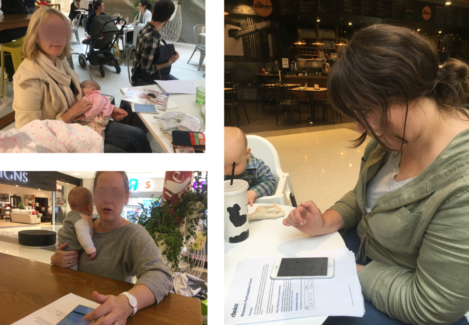
- Guerrilla user-testing! We took our early Framer Prototype to a retail store, and were able to user test our prototypes with expecting parents while they were shopping.
- I enjoyed the opportunity to do some front end development work and build a MVP. Launching in a closed beta with CHOICE customers helped us refine the learnings and test even quicker.
Research
The goal of Bundle was to take CHOICE’s extensive baby product research, and investigate formats that would enhance the content for parents, particularly on mobile and in physical stores. I was really delighted to land on this project at CHOICE, as I was just about to become a new father myself and was aware of the challenges in terms of picking and choosing baby products.
As a UX Designer I paired with a product manager, Justin Farrell, and we set out do some initial user research, that helped fleshed out the opportunity for our users and CHOICE. We talked to a lot of parents, and walked through their recent experiences purchasing specific items like Strollers.
An early learning was that parents often looked to other parents for advice on what to buy. CHOICE’s expert opinion, while valued by parents, were often presented in tables of data to review. We needed to try showcasing the content in a friendly format, that displayed well on mobile, and felt more like friendly advice.
Design
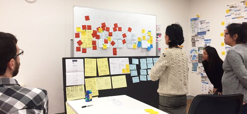
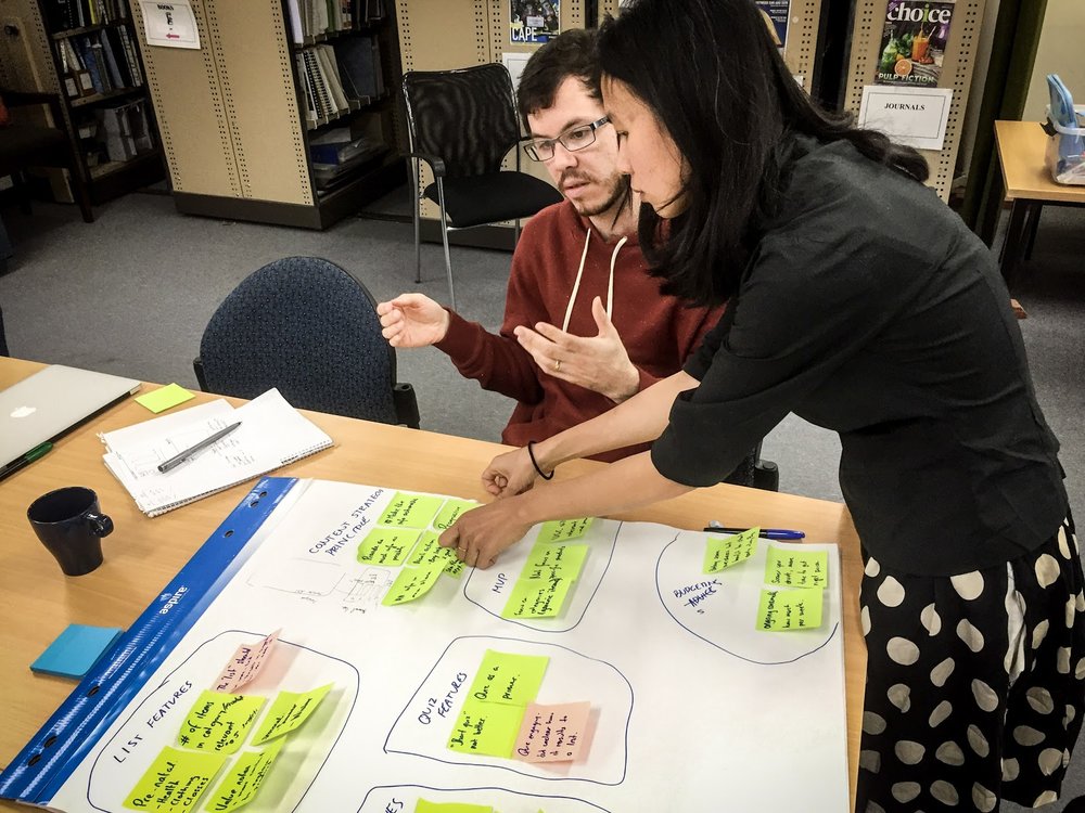
As we collected research we used a design sprint format to compile ideas into user stories, mockups and prototypes. During this phase we were joined by another UX Designer fresh from maternity leave, Nhung Nguyen. Nhung had a clear visions for how our research could come together. This was especially timely, as I had my first child and took some paternity leave.
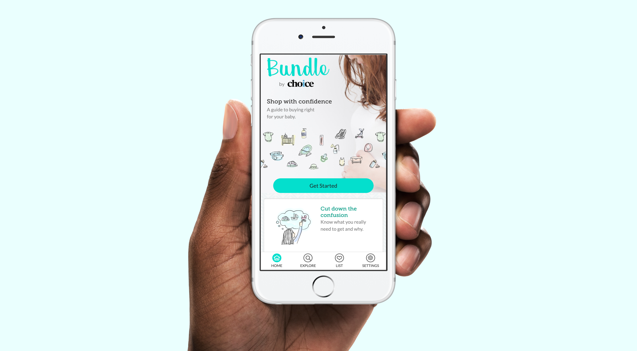
When I returned Nhung and I worked closely, taking her Sketch mockups and producing a high fidelity prototype in Framer to user test in the wild. This collaboration was very impactful, as we found that we could get a lot of context and insight by talking to mums and dads actively in consideration about buying a baby product, with a realistic app to use.
One key idea that came from user testing, was to allow users to start adding items to their list before they create their account. This avoided the initial passwords/email fatigue that comes with sign up. As our users first session was likely to be in a busy retail environment, it made sense to offer utility as quickly as possible. This challenge was a perfect mix of UX and Dev, where I had the UX vision and technical understanding on how to make it work.
A screen recording of the prototype in action.
Development
A screen recording of the final MVP app
The prototype and our research’s success helped us move to a new phase. I would take on the role of a full stack developer and build the MVP app supported by the team over two months. The end goal being a closed beta launch with vetted parents.
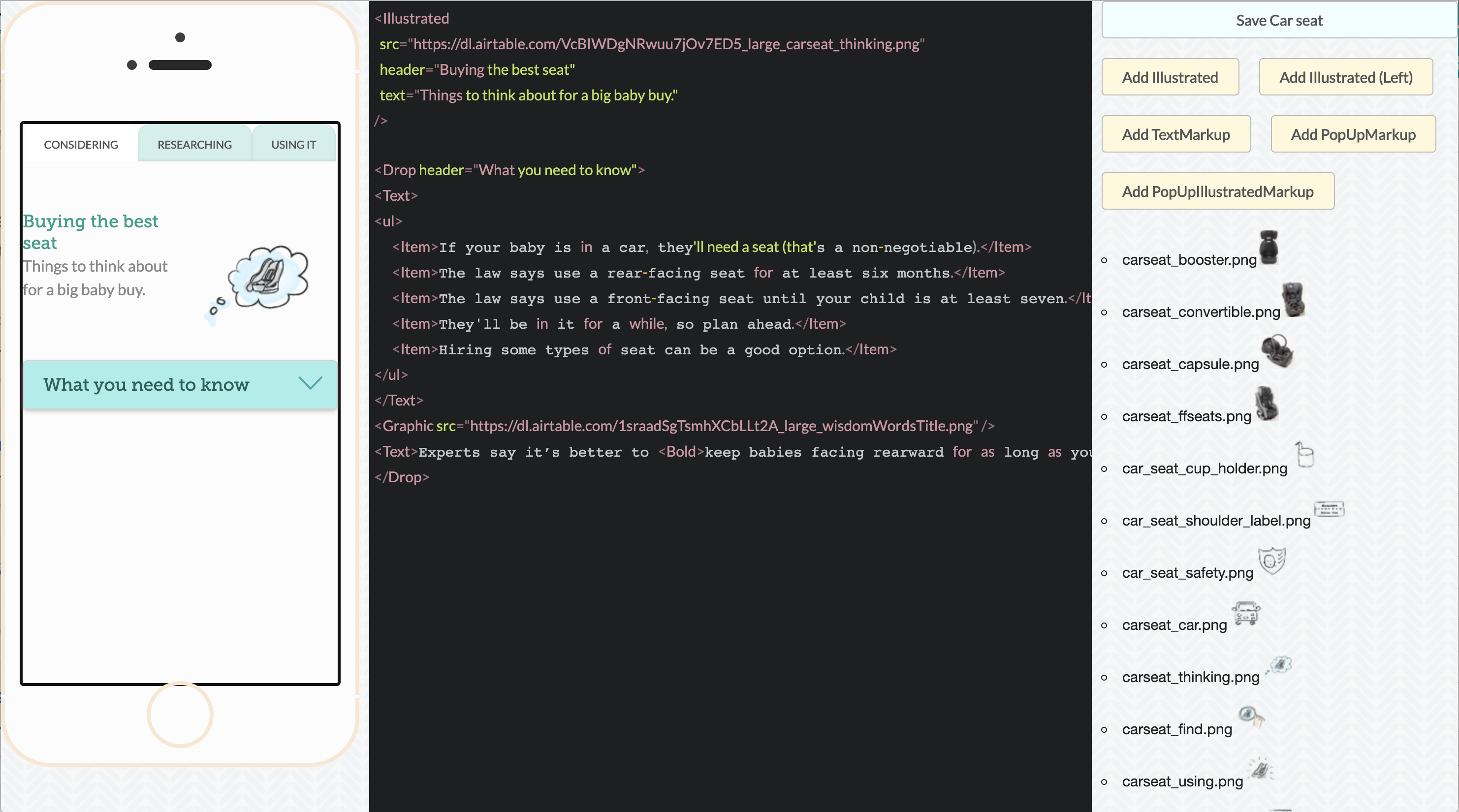
I worked with our UI designer to create a design system with custom components built in React.js. This design system and it’s branding approach made CHOICE’s content look and feel friendly and accessible.
To encourage iteration of our app content, I created a workflow for our content producers where they could author unique layouts, using components from our design system to enhance the content. This helped make the app content feel hand curated, and allowed us to enhance the content, especially for mobile devices.
Before launch I helped recruit our first users in a dedicated Facebook Group, which allowed us to have high interaction and collect feedback. We conducted smoke tests within the apps to gauge interest in new features and payments models.
We had incredible feedback form users on the format of the app and it’s content. We solicited more ideas, and iterated further with the design.
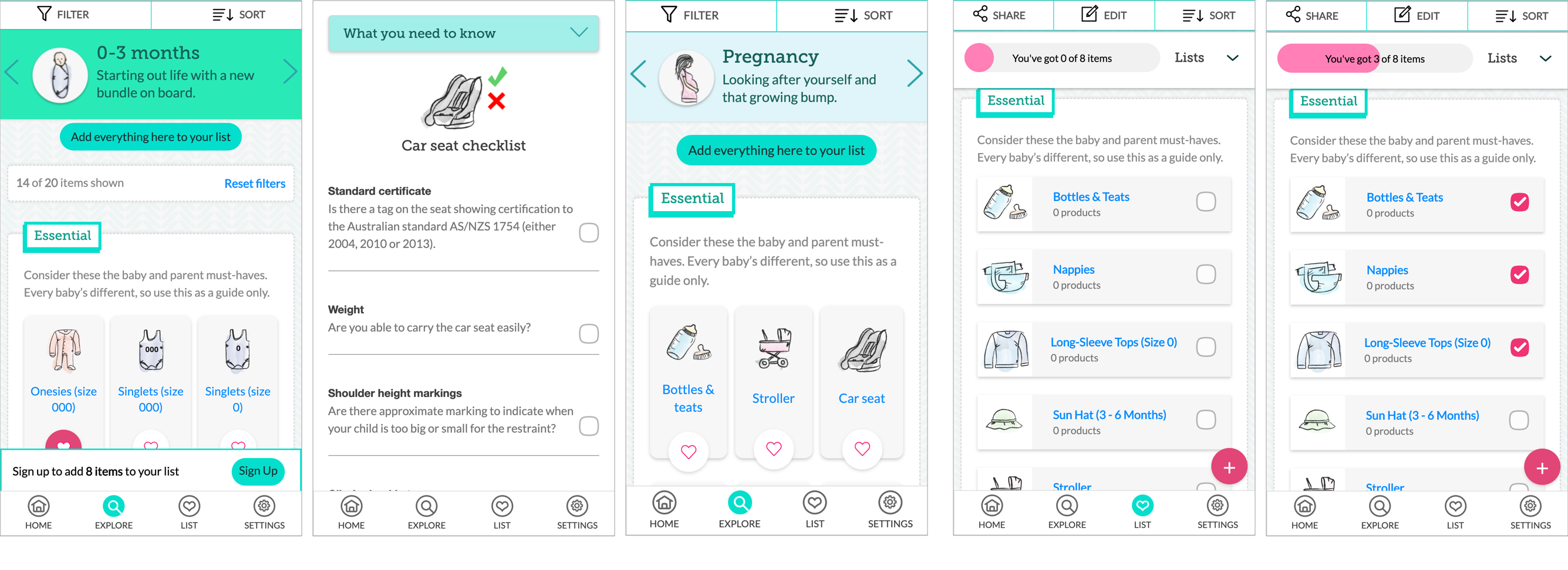
Some screen shots from the final MVP app.