Welcome, what follows are the slides and notes from my original presentation. Buckle up.
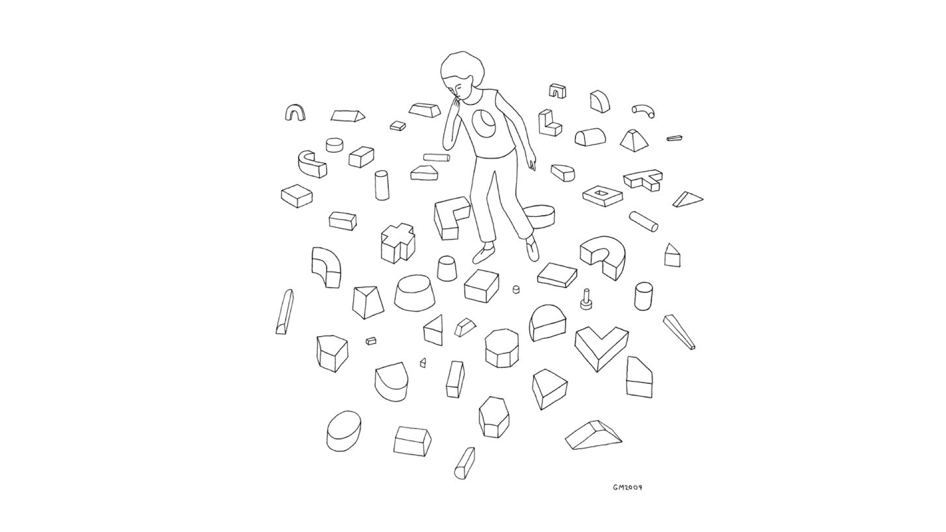
Maybe not for you, maybe not for me, but for people we know. It can be really overwhelming getting started with a new design system.
It can feel too Restrictive
Feel like all your idea bubbles are about to burst.
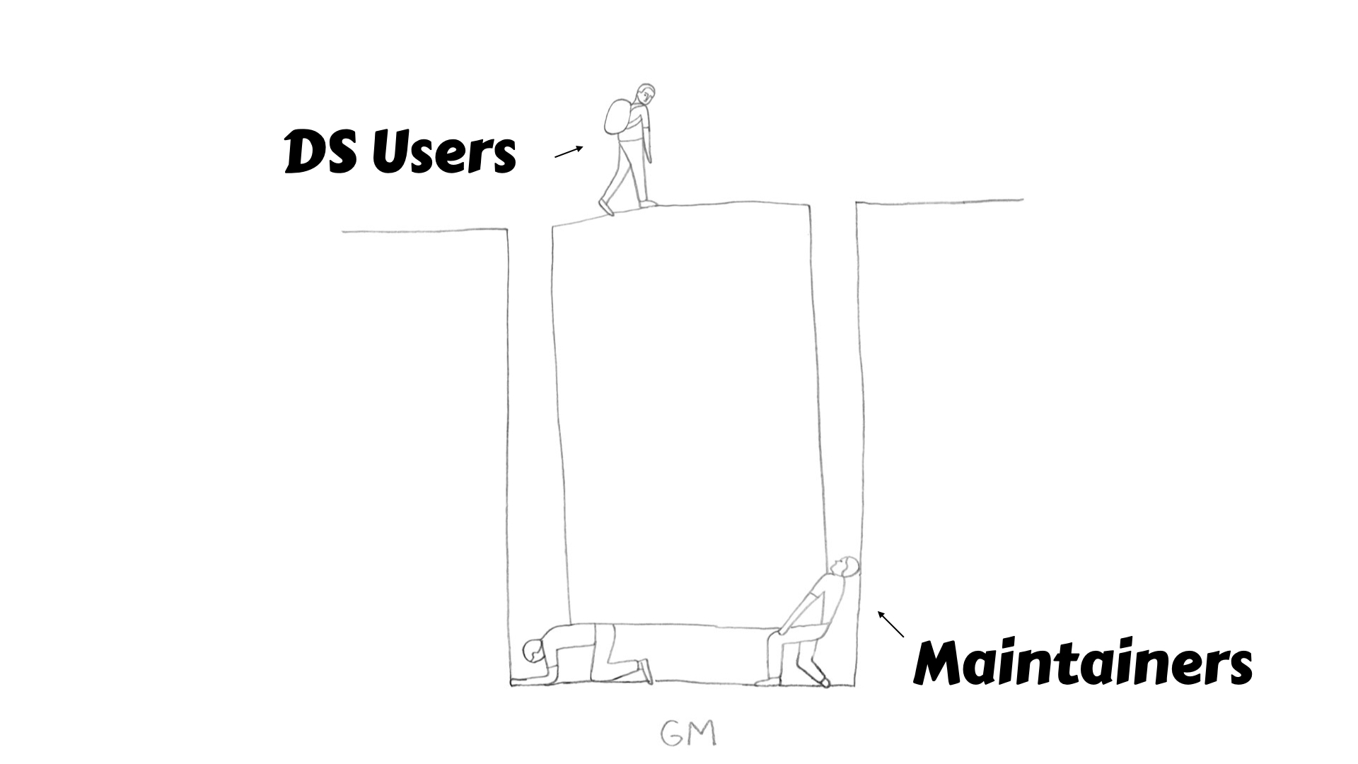
These feelings can create a unhelpful gap between users and maintainers.
How can this be avoided? I’ve got a fix for all of this. 4 easy tips from 4 different observations from my own experience being onboard to a great DS. This talk is for both DS maintainers and users. But before we cover the tips I have a few introductions.
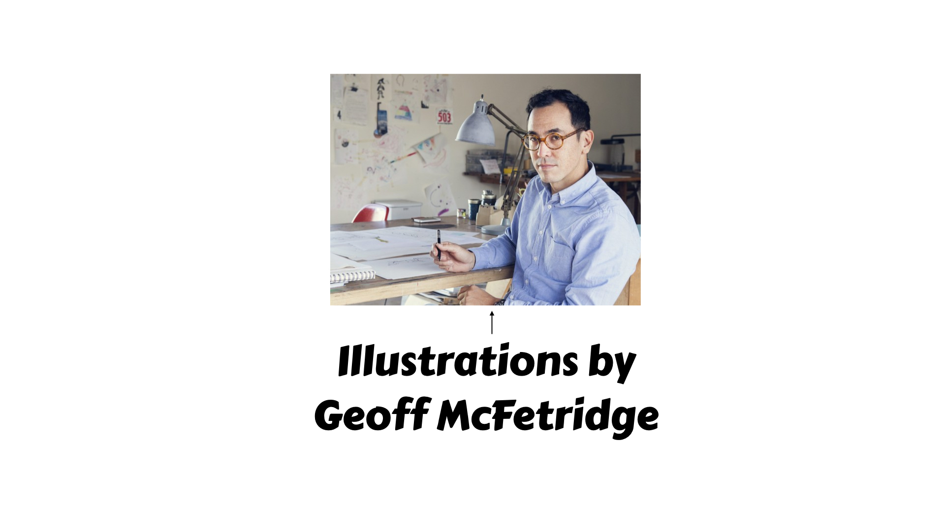
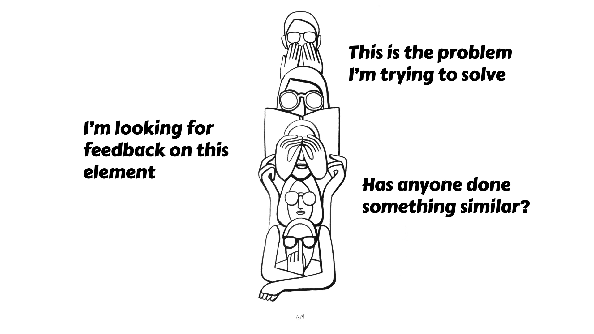
My pal or rather my fav visual artists Geoff McFetridge is gonna help tonight
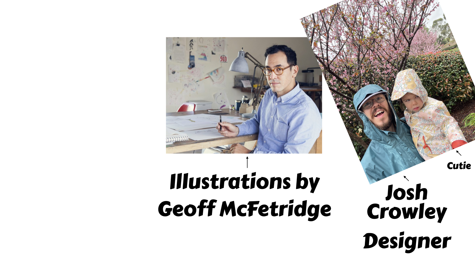
I’ll be your guide, I’m an interactive designer at Dept. of Agriculture. I’ve been lucky to be designing stuff for 10 years at the ABC, CHOICE, Uni Canberra and now Department of Agriculture. I’m not a design system maintainer, more of a super fan.
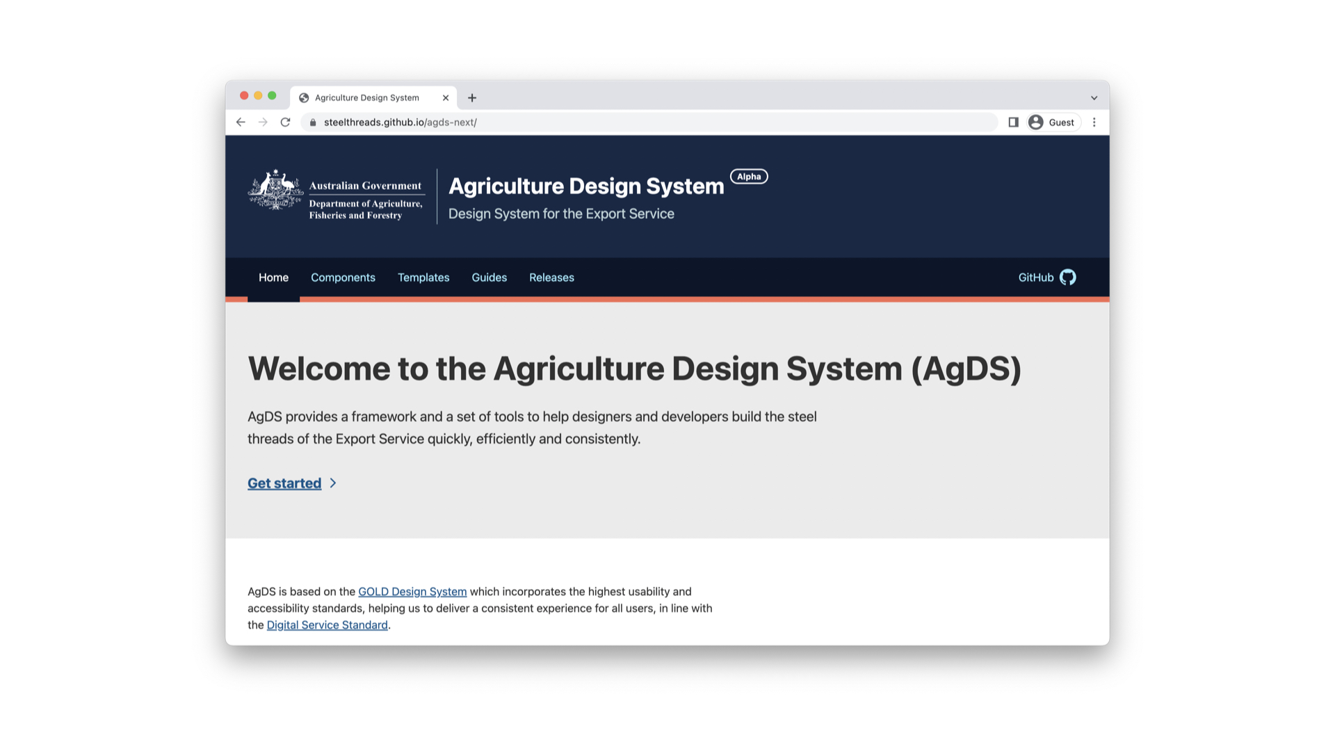
Particularly of this DS, which I use day to day - Agriculture Design System. Open source, React based, used by the Federal Department of Agriculture. Getting onboard and getting to know this DS over the past 4 months has been a pleasure, and reflecting on the experience has generated the 4 tips.
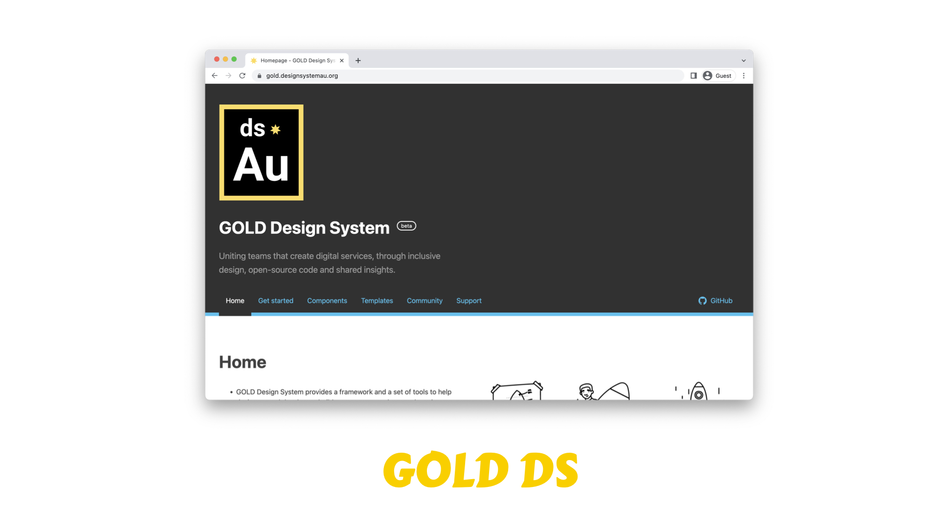
AgDS Builds on the excellent work and legendary status of the Gold DS, which came out of the DTA and has proven to be a north star for the team. Past contributors/maintainers speckled around here tonight (if you’ve worked on Gold, maybe raise your hand). I believe Gold was announced here at the first Design System meetup.
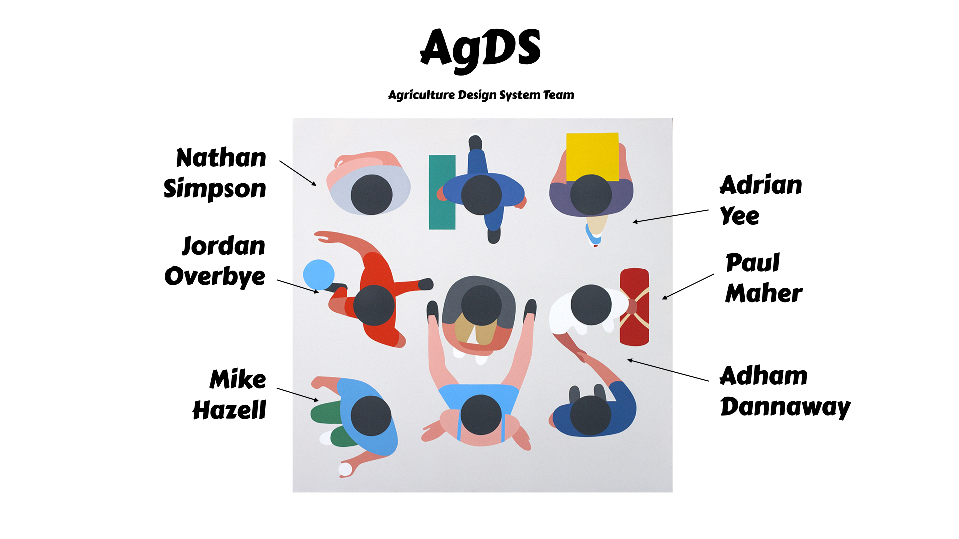
These wonderful maintainers deserve full credit, lead by Adrian Yee.

Design systems that play well, have accessibility embedded at the heart. Just this week the team had a big milestone, the team recently completed a WCAG Compliance Audit with Intopia and have been issued with a certificate of conformance. Building on the stronger foundations, the team were able to get into some advance patterns of improvement, which I think would make a fine talk for another day. Intopia, have called it an excellent example of accessibility, React based Design System.
My first tip is build, build the tools. This team has built an excellent tool set, which I want to share with you now
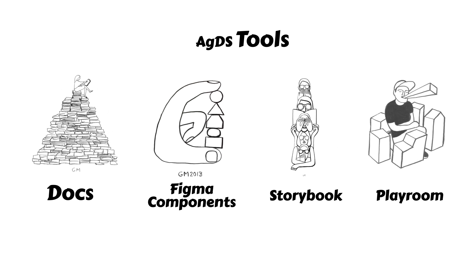
Docs, Figma Components, Storybook and Playbook
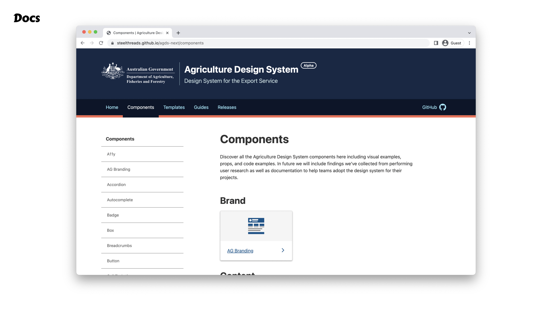
Docs – Showcases all the core concepts, like DS primitives and the components.
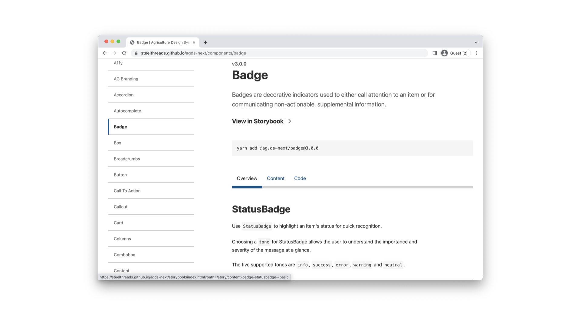
Each component’s affordance and use cases are well described, plus there’s links to other resources – see for yourself here
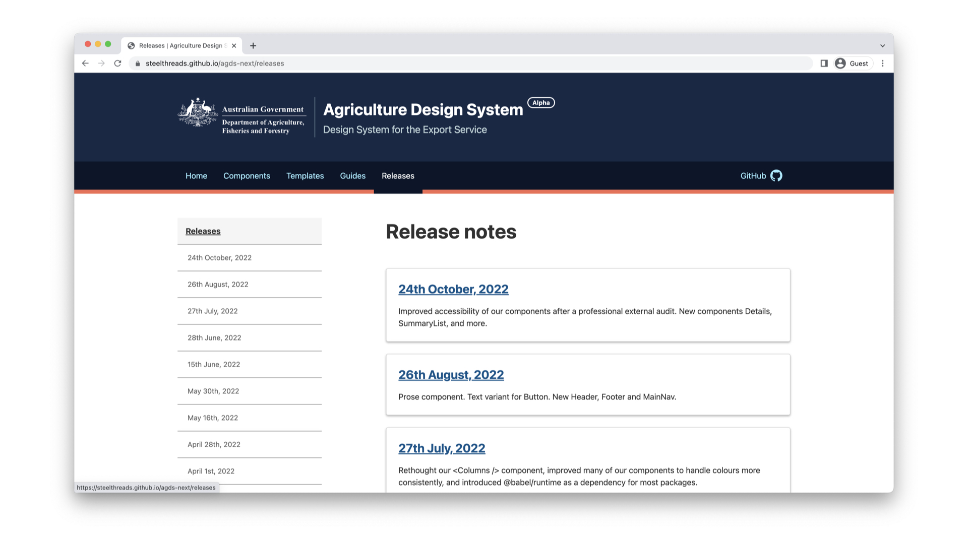
Clear release notes, chef's kiss
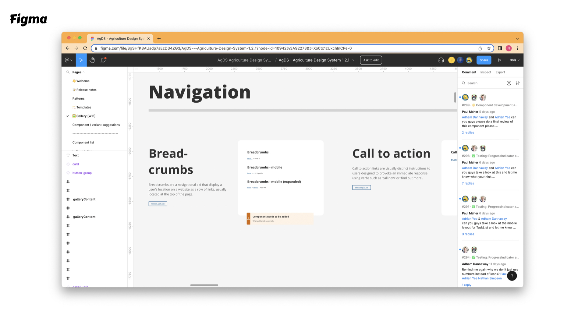
Robust, comprehensive and up to date Figma library
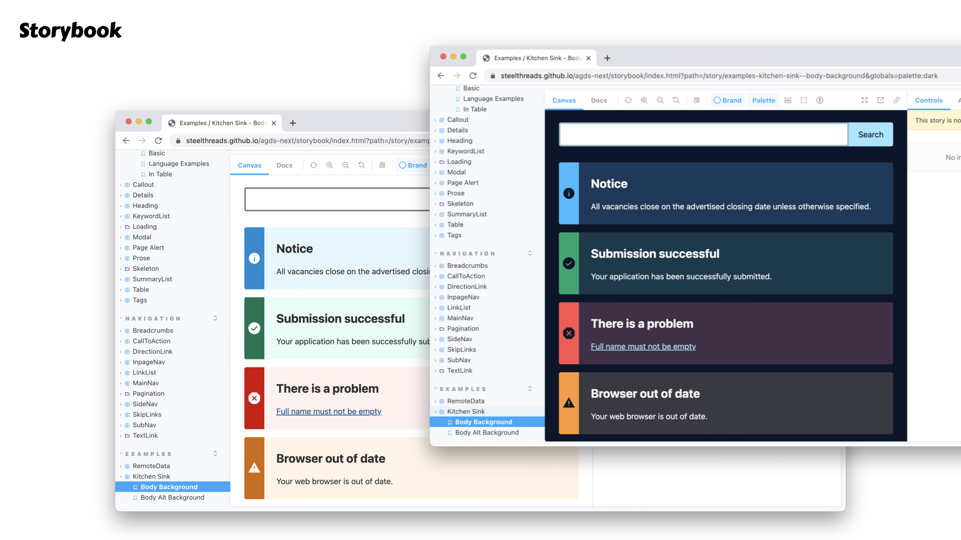
If you haven’t used Storybook before, it’s an excellent way to document the props and variants of your components
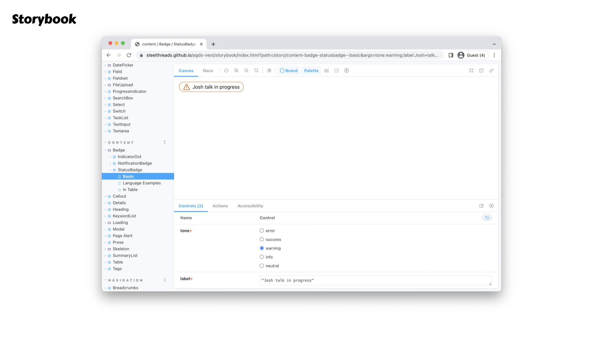
Here’s me changing the values in the component. Excellent way to start playing with your design system. But it gets better.
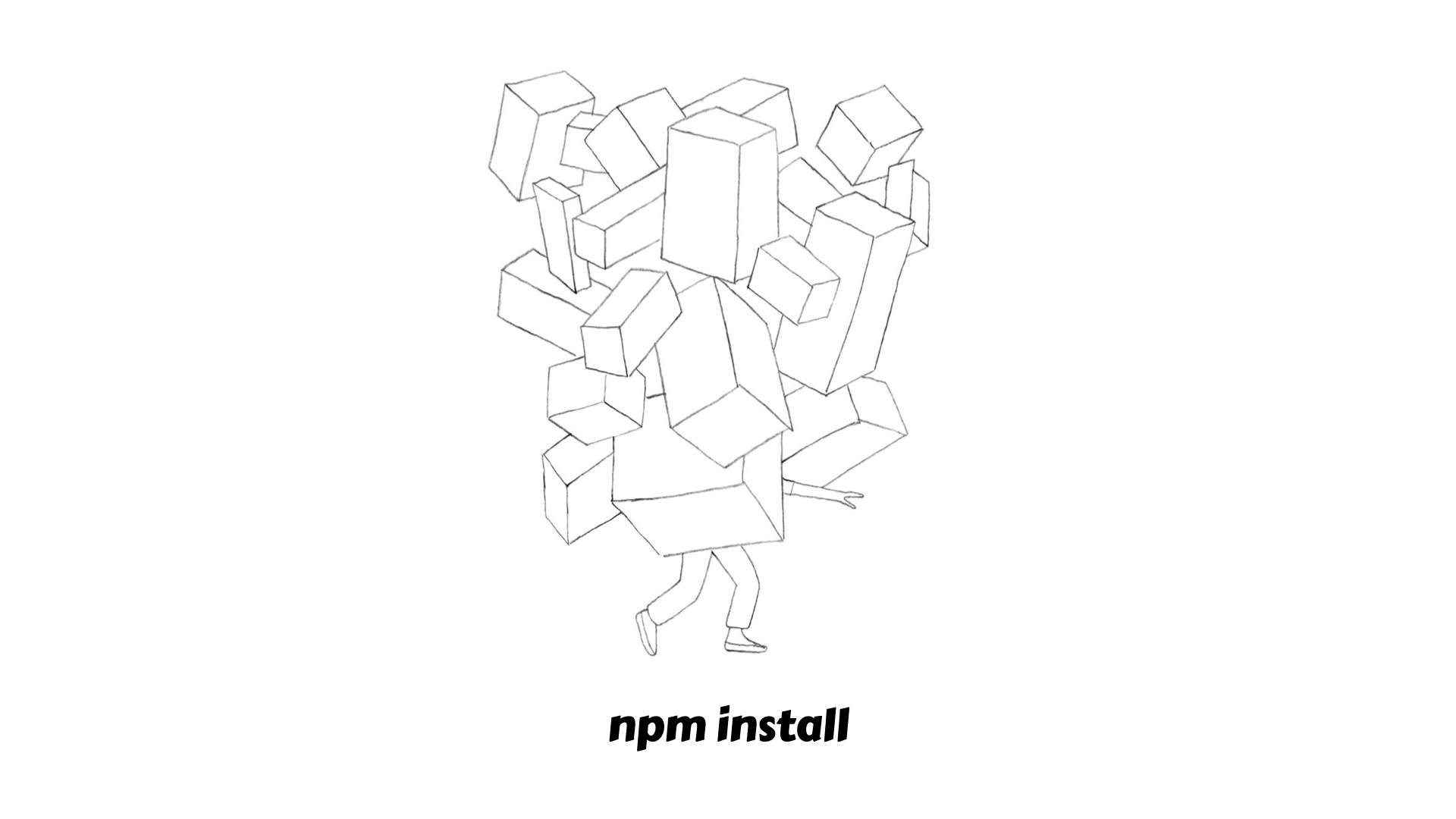
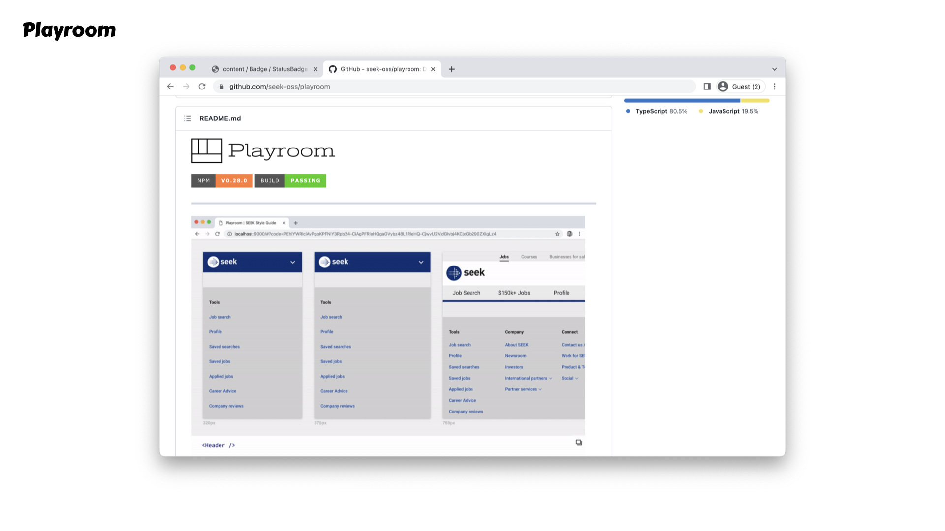
Playroom brings the components to everyone's finger tips, to push and prod without all the palava that comes with modern JS workflows. Though I’m sure it’s not trivial getting playroom to play nice, and been a lot of hard work from Nathan and Jordan to get this up and running.
The coolest part of playroom is that it’s linkable.
So hopefully you’re starting to see how these tools give us affordance to investigate our DS and experiment with it - next step is that all stakeholder need to actively promote and show these tools!
So Adrian our design system lead took me through all the tools on Day 0 of my first new job. He made sure I knew where everything was, what it is, I had access. Left me with a lasting impression that these tools are fully at my disposal.
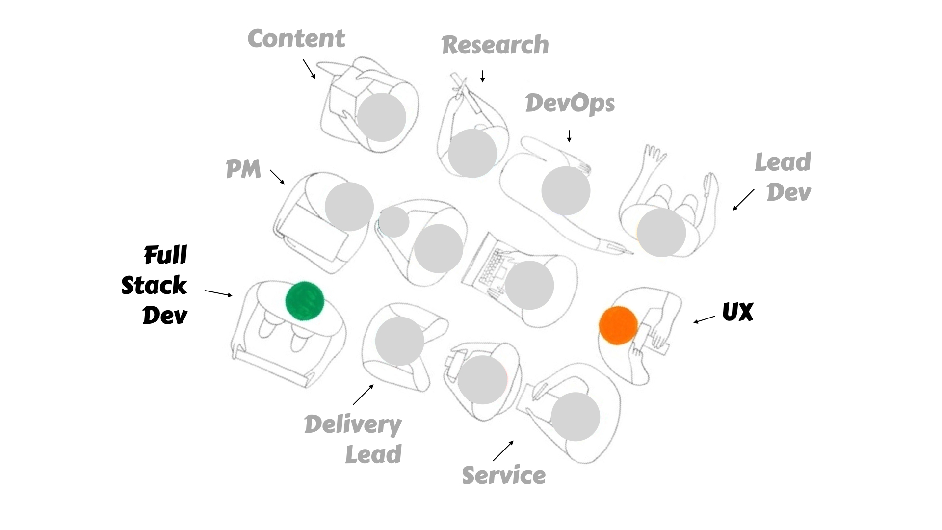
Too often we see DS through the lens of specific roles, where as
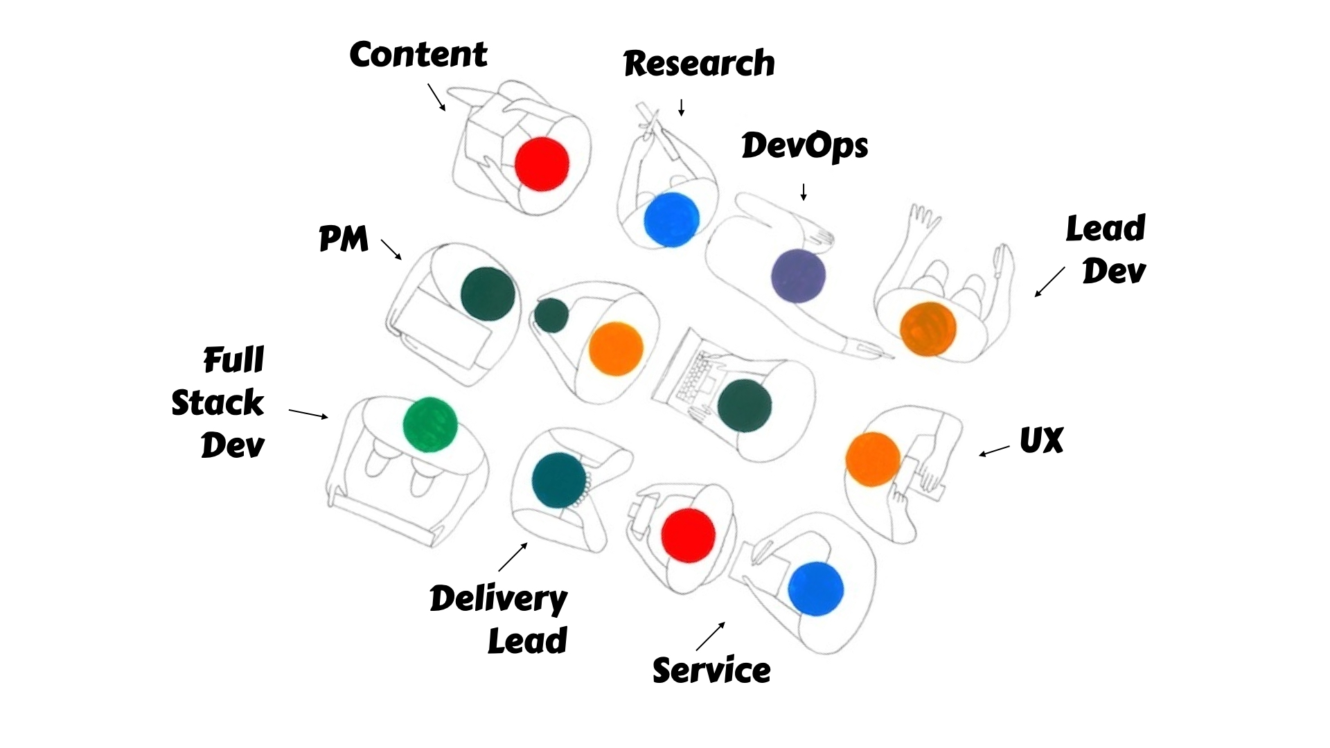
It should be a team wide resource, considering that it does play into everyones outputs at different times and different ways
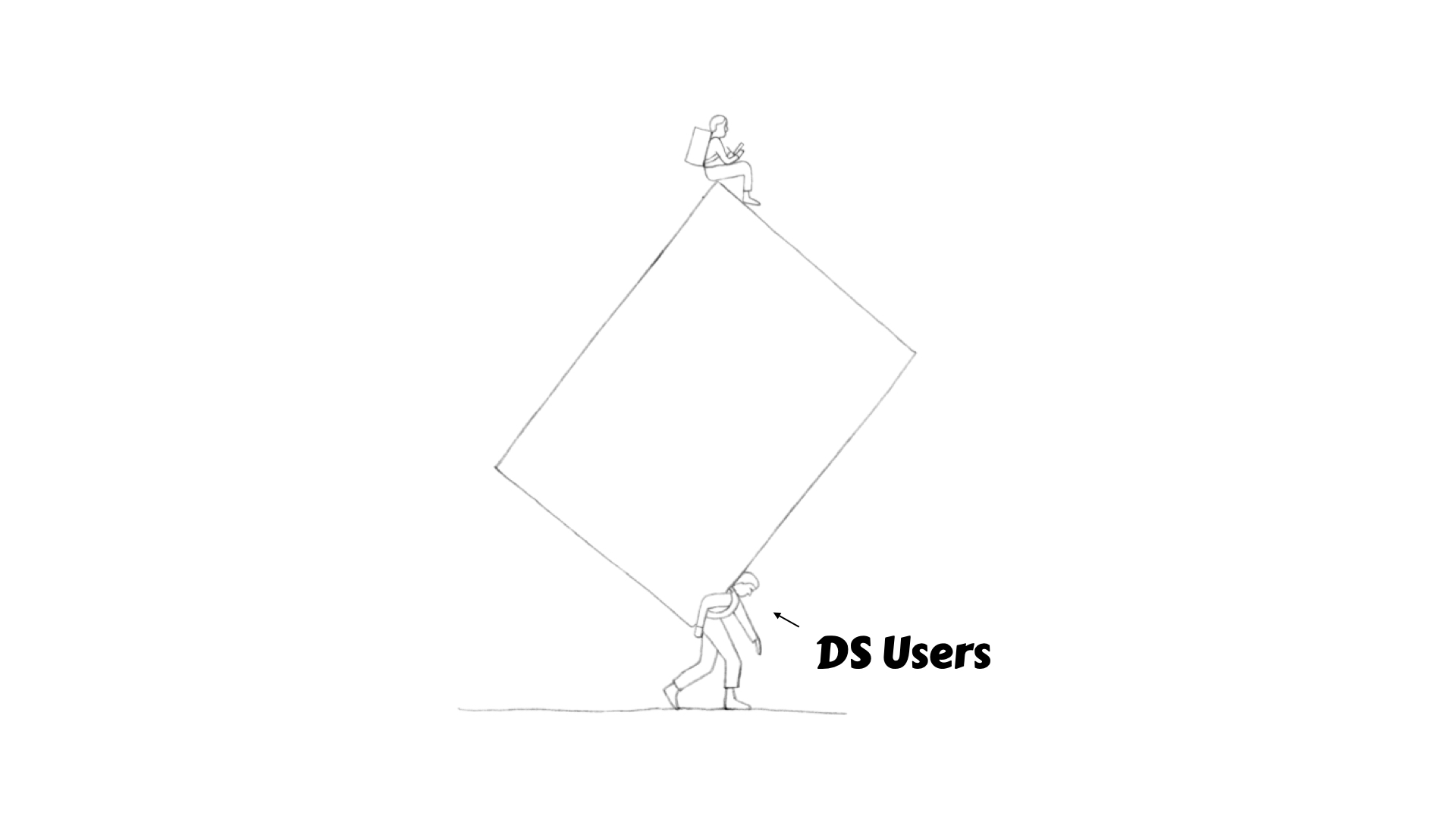
This is where we turn the tables and the DS users need to think about how they can connect with the DS in their work
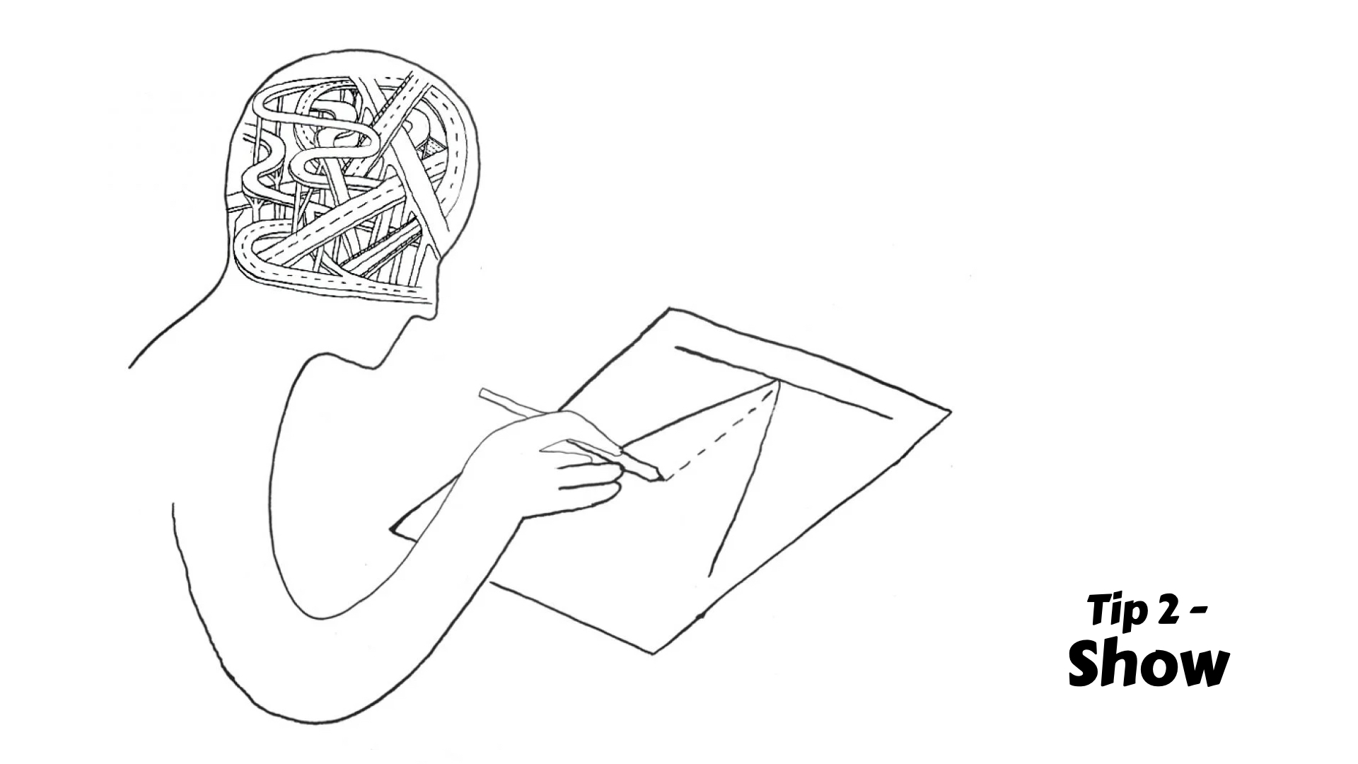
Show how else can we show? Just reflecting on one experience I had working with the Badge component from AgDs
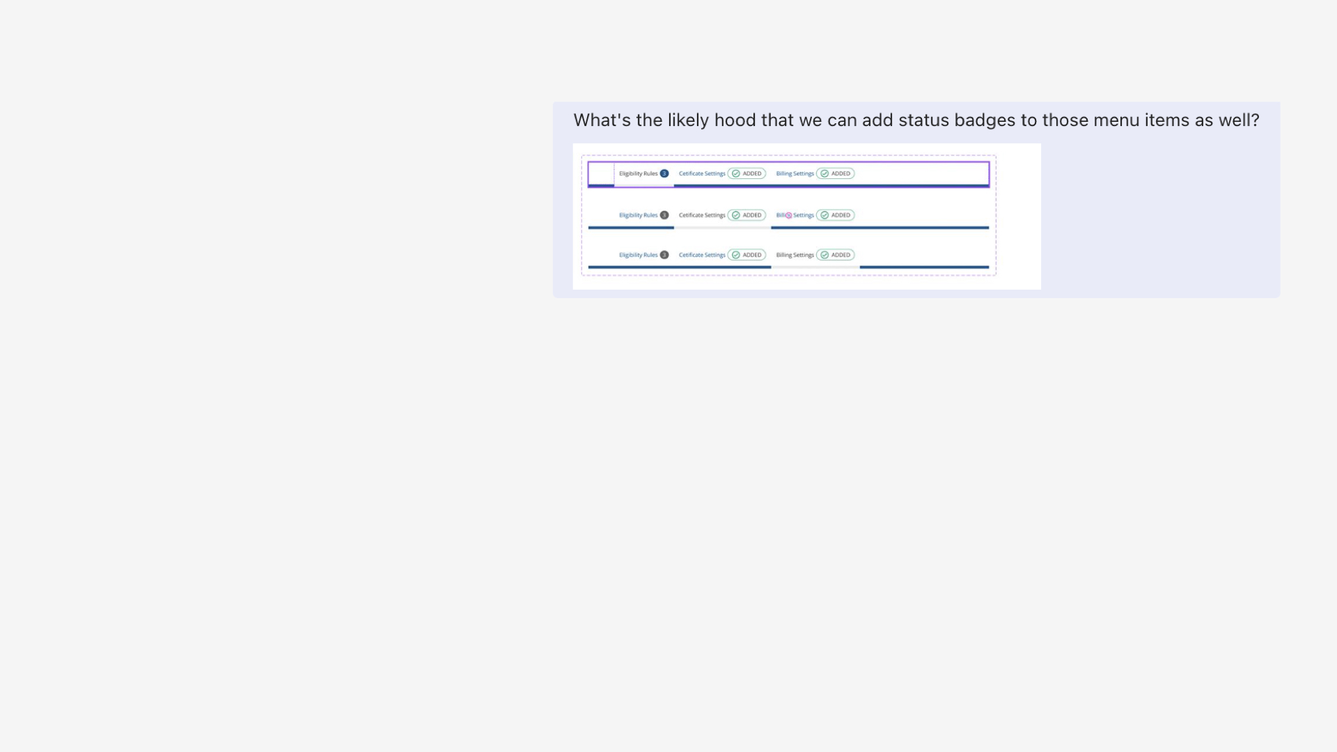
Send through ideas for a new use case
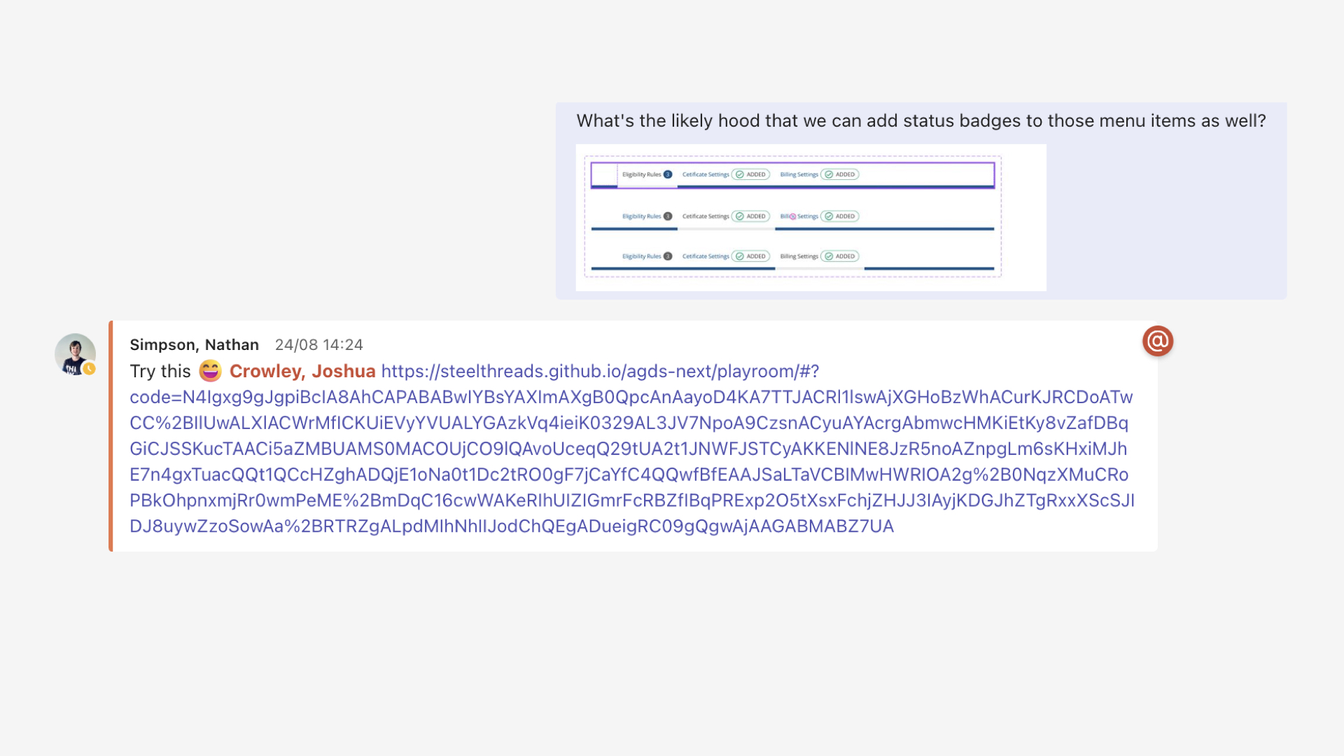
Minutes later, a prototype in Playroom
Boom, now I have a link to show around and get feedback on and iterate forward
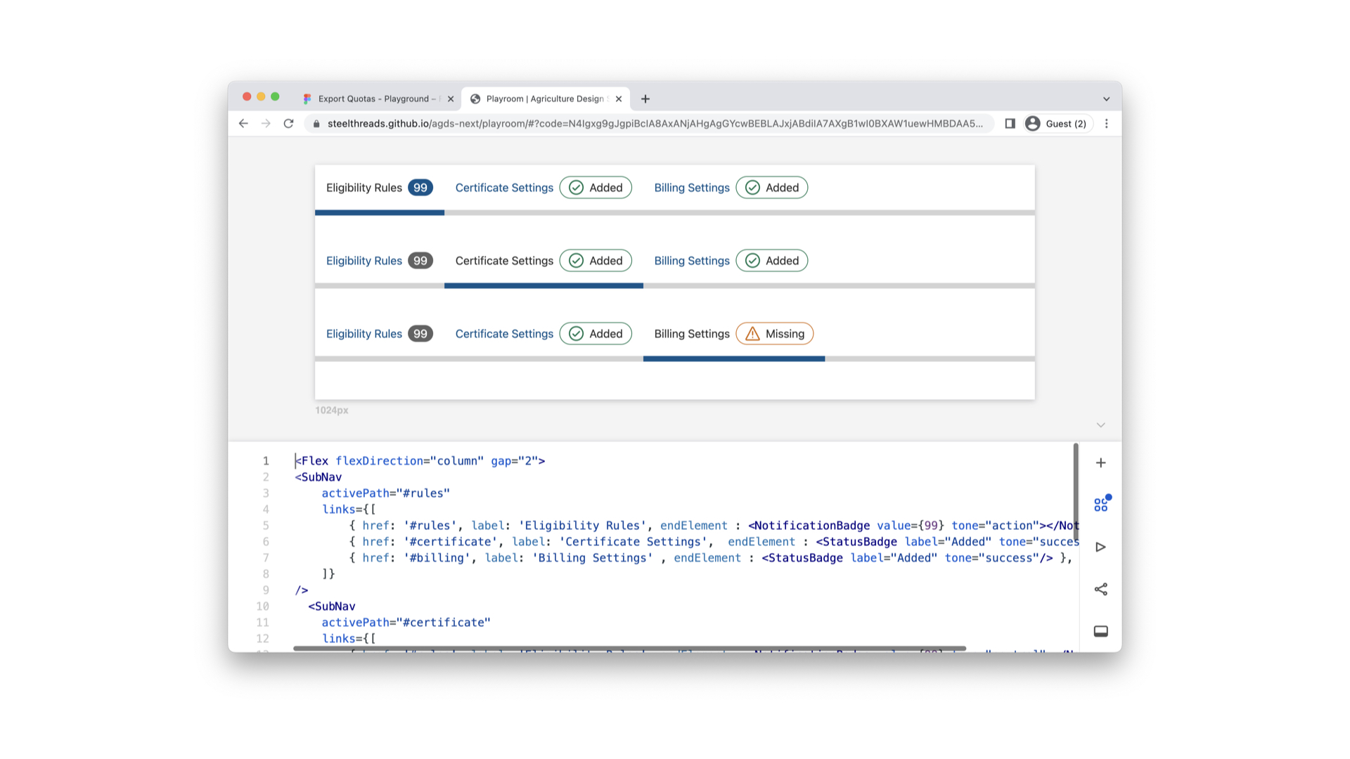
Not every idea we tried was a good one, and we had some refinement which was easy to take on board because the stakes were so low, we’re not even in the codebase yet remember.
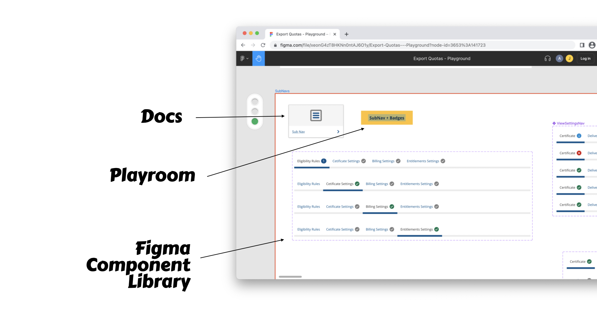
Embed the tools into the Figma designs, so other team members have an entry point.
Finally Agriculture has a great Design culture, where there’s regular guilds to share and get feedback on such ideas and assets.
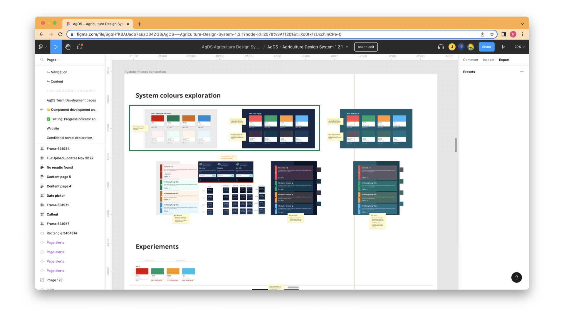
I also love how the AgDS team show us their experimentation and sometimes I can sneak in and play with un-released components.
Showing enables reflection and introspection , which makes us better designers.
Design systems give us room to grow
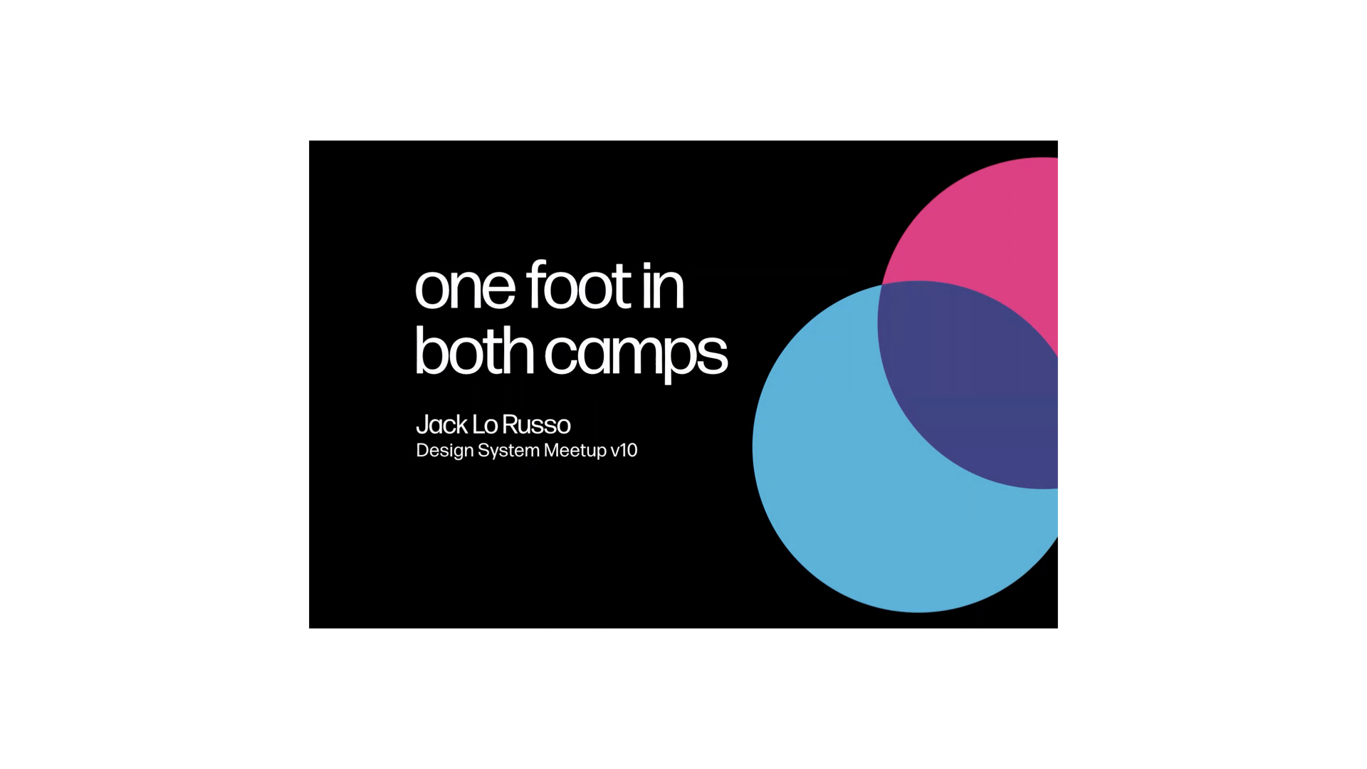
My fav design system talk
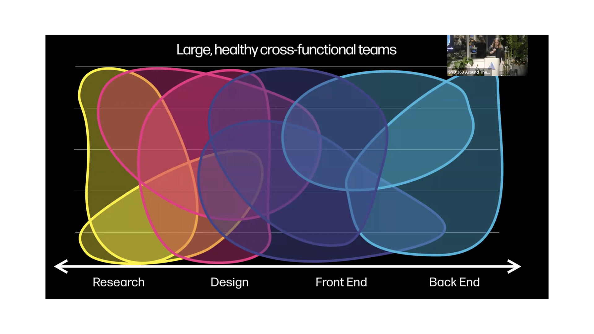
You can watch this talk here, but these blobs really hit a chord with me. We should encourage team members to blend and share insights and experiences.
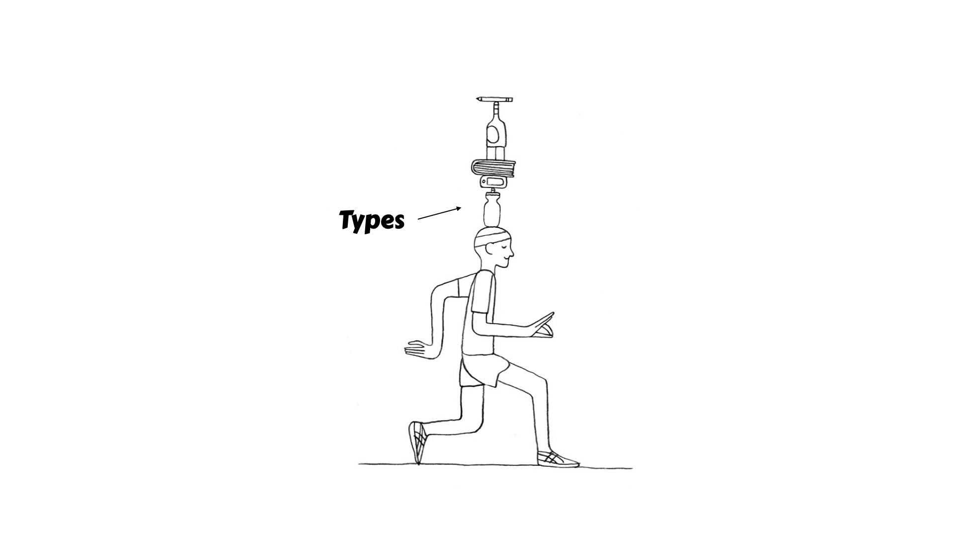
Take a modern dev for example
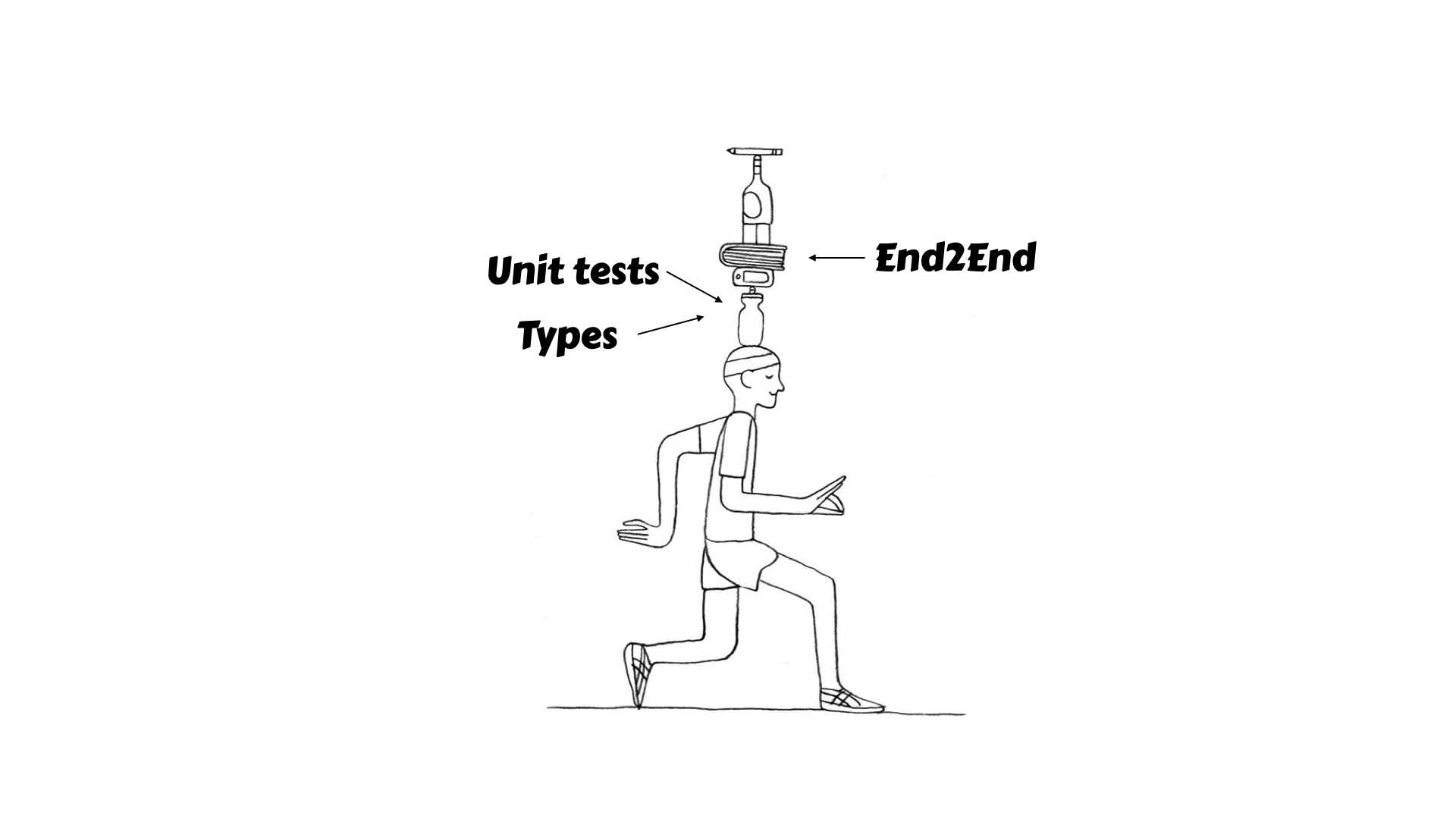
There’s just so much complexity
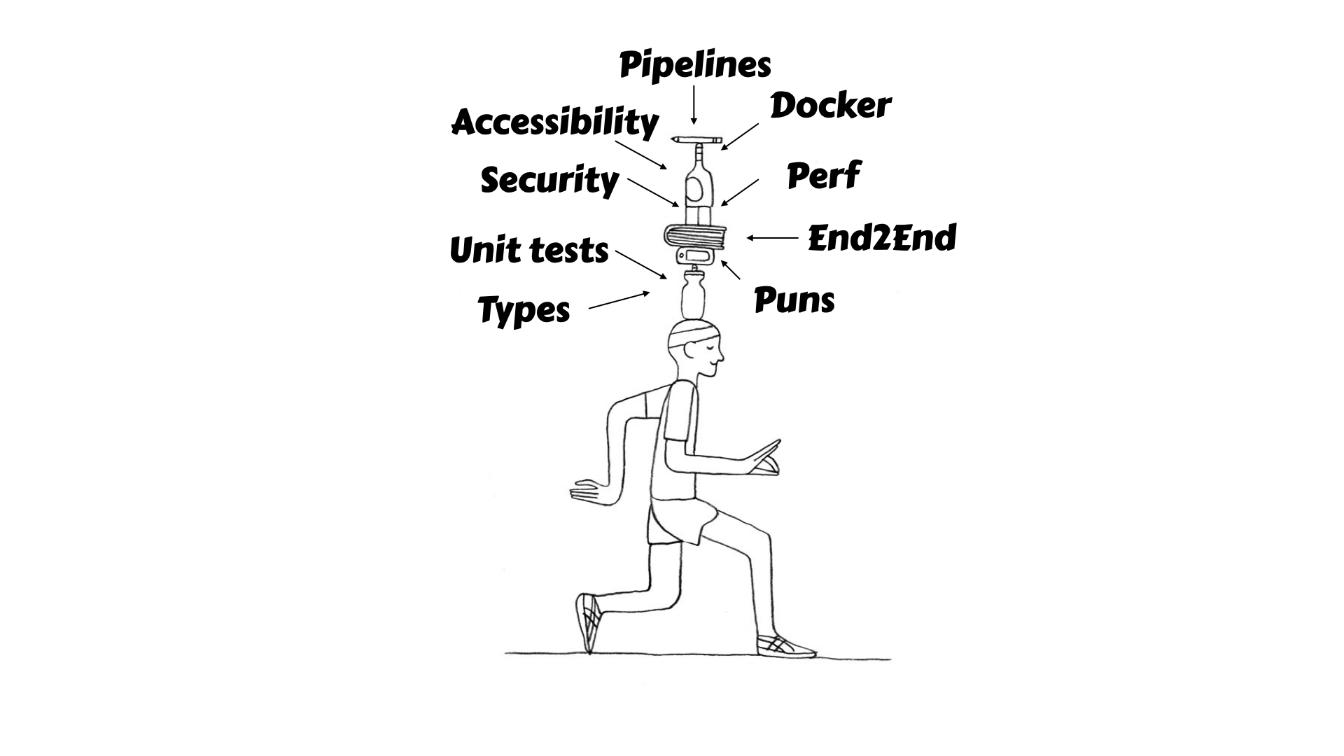
The role and idea of a developer I think has doubled in scope since my career has started, which has it’s challenges and opportunities.
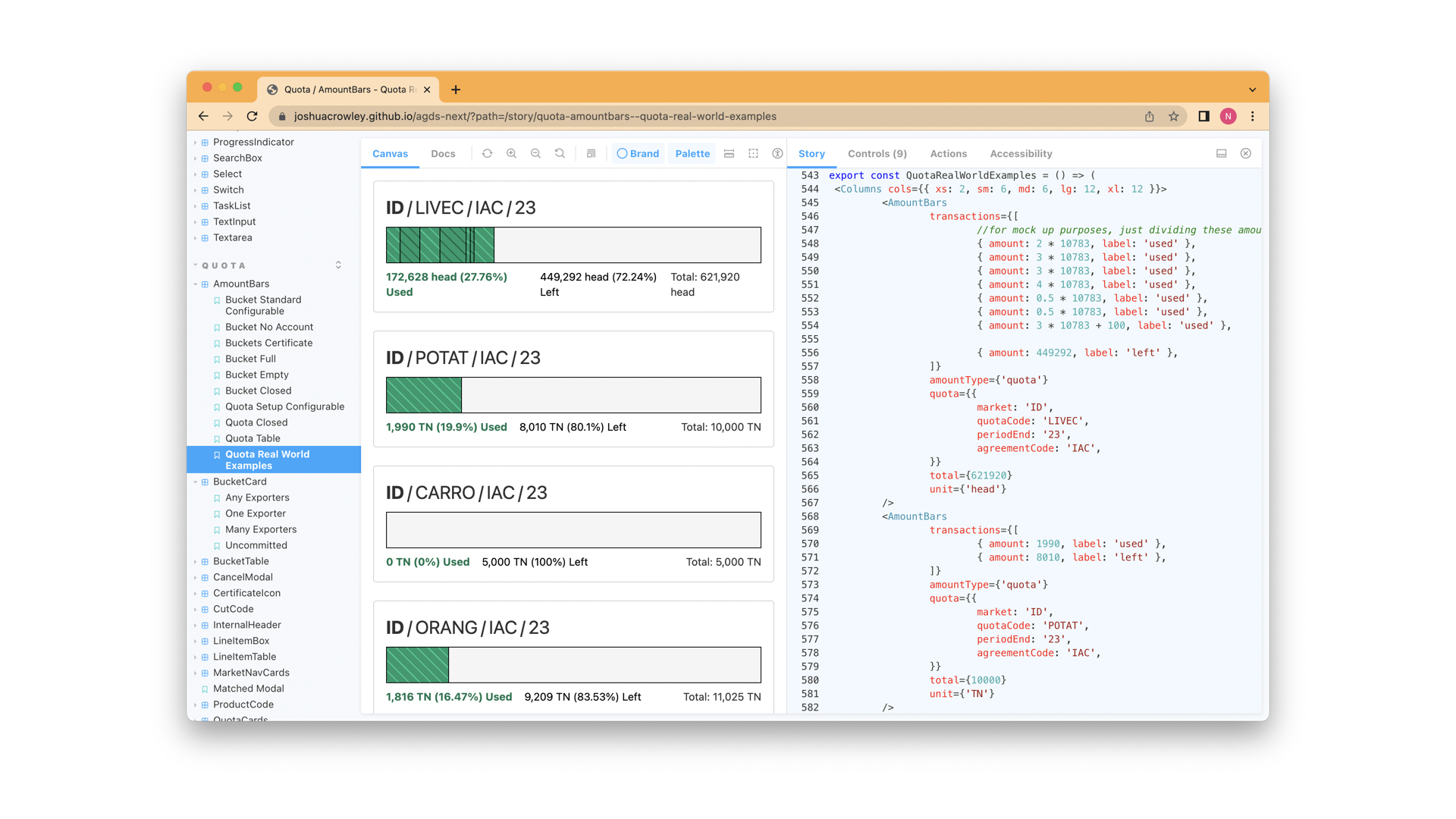
In my own experience, because of the support that DS gives me, I’m empowered as designer, to extend our storybook and build out mocks and throw away code to help give a plan on how to get our ideas into the codebase. I’ve enjoyed this because again, the stakes are low, and we can get rounds of feedback in well before this hits the code base.
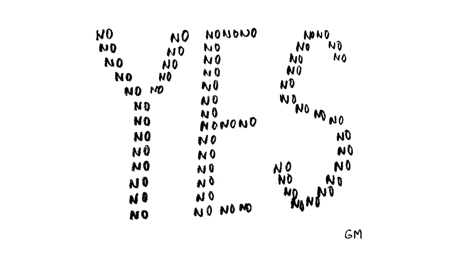
So here’s your permission to blob out, and allow the DS to grow you and be a safe space to be curious and passionate
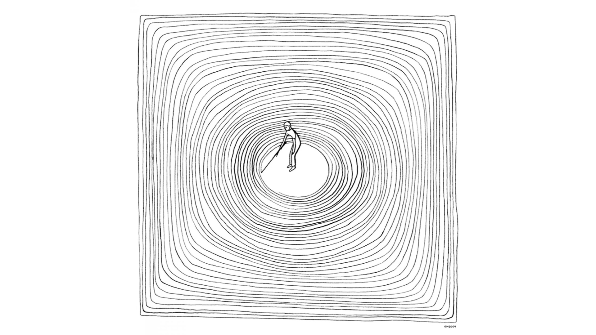
Don’t box yourself in, let’ the DS be your ticket out
So this last one I must admit is a piece of advice for myself as much as the rest of you. It’s an idea I want to seed, perhaps for someone else future talk.
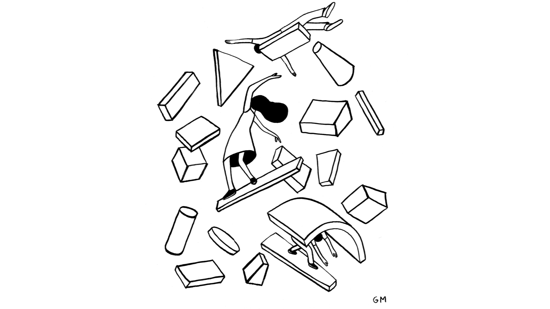
Rules are meant to be broken, how can we create safe space to explore the constraints/systems we are using? Why do we wait for high stress, production examples to run into problems with a DS. I don’t know tbh, I’d like to see this discussed more.
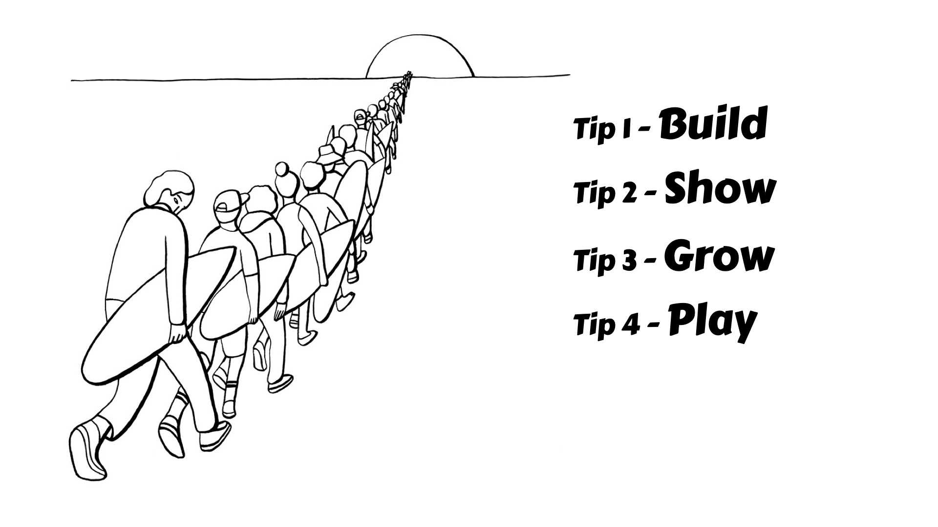
Build tools to support DS users day to day. Encourage DS users to show you how they’re using the DS, in their designs in their code. As a DS user, lean into advocating for the DS, and bringing along your team.
