MathsBURST
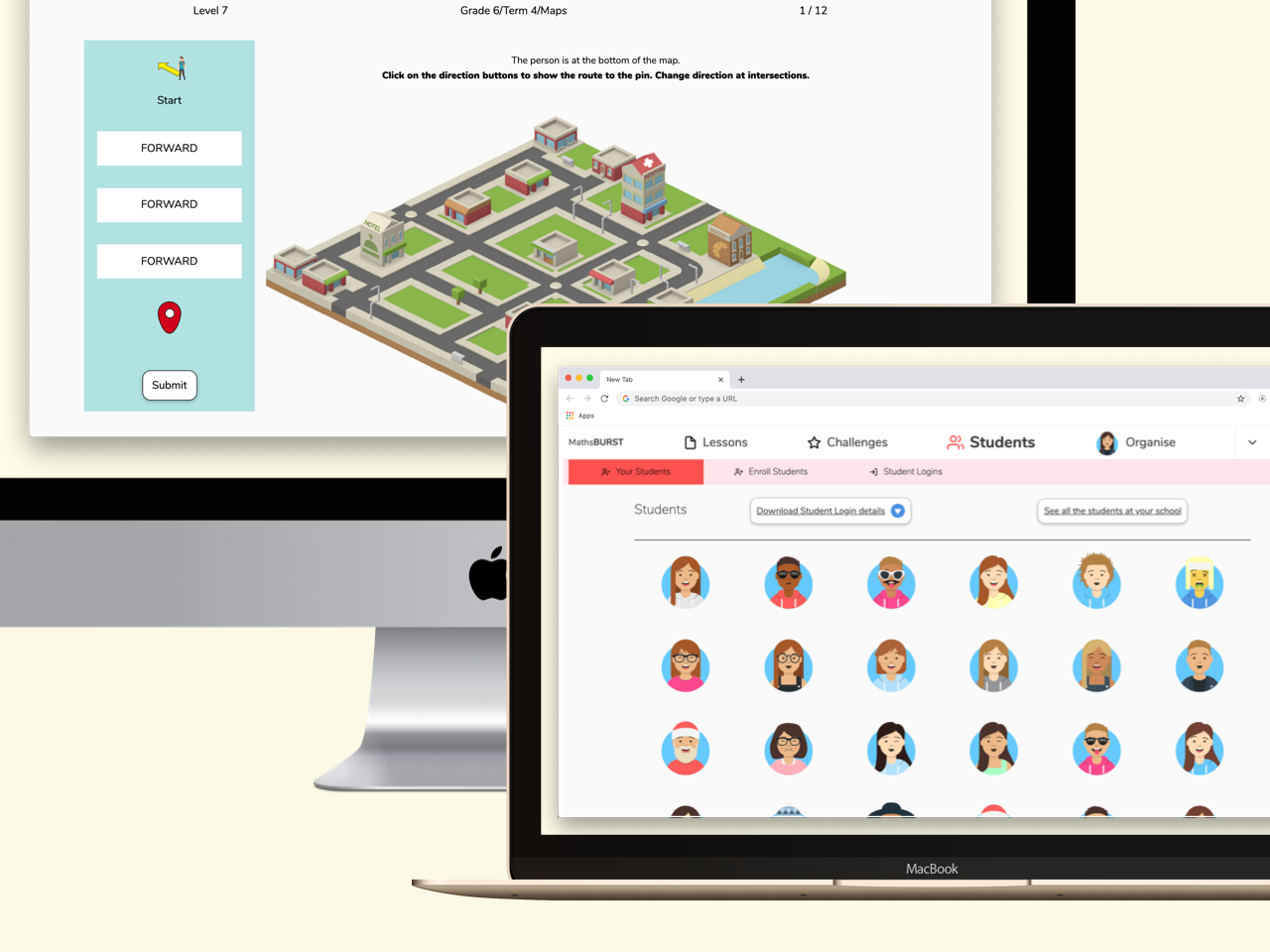
A complete web app platform for maths educators
My Role
On this small team, I was responsible for all design and development of the MathsBURST web app for students and teachers. The MathsBURST team includes world class academics and passionate classroom teachers. We worked collaboratively to build a maths education platform for primary schools in Australia.
It's unusual for a designer to handle full stack development for any project. This was a unique opportunity, and I was greatful for the trust from the team when I put up my hand to build my initial designs. My prior experience building prototypes and MVP web apps meant I was ready for this challenge of scaling to real users. Being able to work closely with our small team to keep the scope tight, given the constraints of my time has been a big factor in this hybrid role.
Highlights
- I co-designed and developed 24 web maths games for primary school students grades 3-6. The games were attempted 200,000 times by thousands of students in 2019 alone.
- I designed and developed an Educator app for teachers to use in their classroom.
A Complete Platform
Overview of the MathsBURST educator app
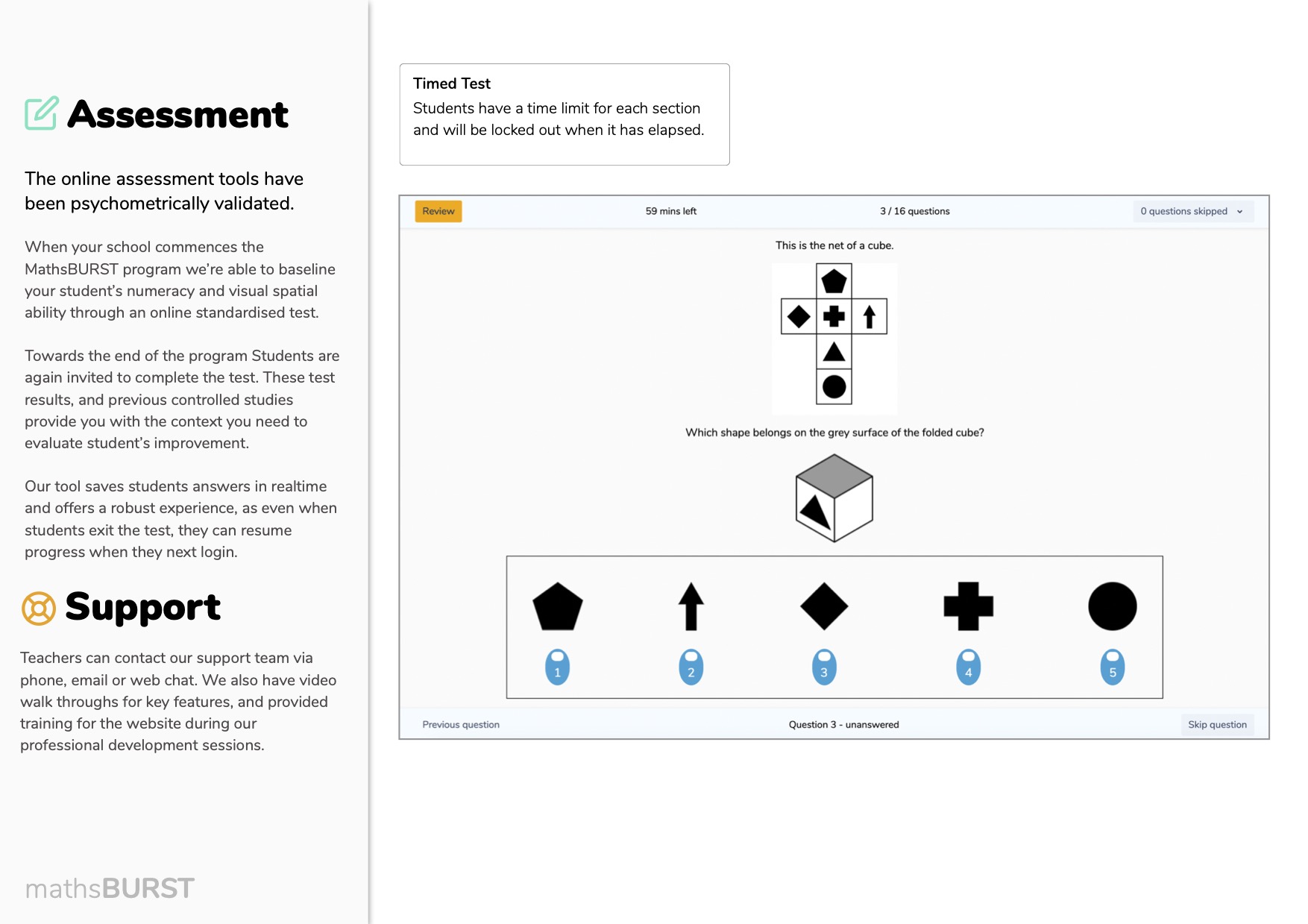
MathsBURST was built to be fully integrated platform, with all the components easily accessible to teachers and students through a single account and web app. This included, lesson plans and professional development material. Student's dashboard and access to Challenges. Assessment tool for measuring progress of the students at the start of the cohort and at the end. Plus of course support resources for teachers and schools.
We built the program around the concept of phases, which allowed teachers to progressively be directed to different features and content for students, in sequence as they progressed though the year. This helped orient the teachers in the app, reducing the cognitive load for an already busy classroom.
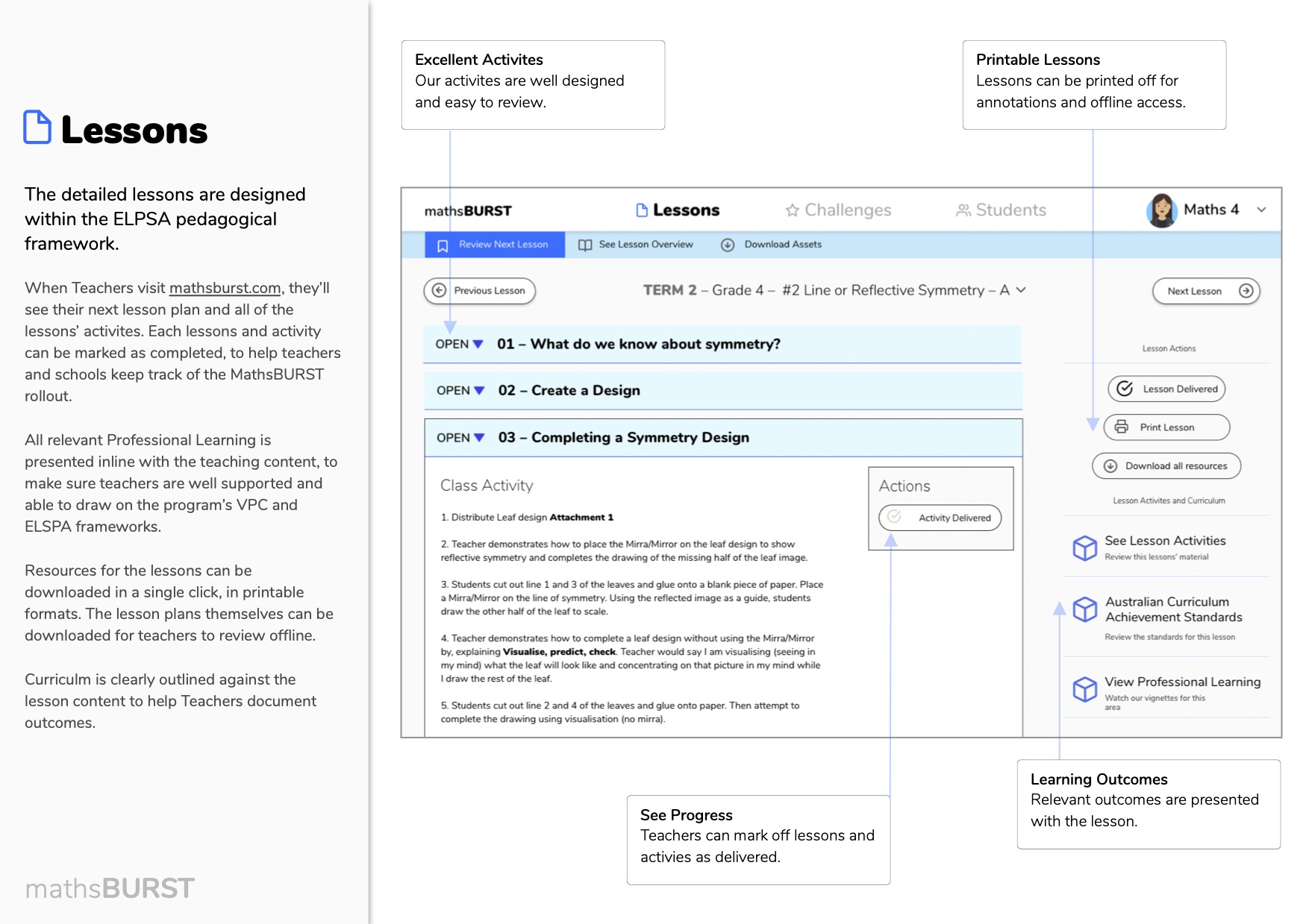

Classroom Insights
My previous experience with the ELSA team taught me that classroom technology integration presents unique challenges. Throughout this project, I visited several schools to observe the app in action and collected valuable feedback directly from teachers. These insights shaped our development approach:
- Teacher confidence: Many primary educators lack confidence teaching mathematics due to limited professional development in this area.
- Device diversity: Schools use widely varying hardware - from aging iPads to new Chromebooks and classroom TVs. Web-based delivery was our only consistent platform option.
- Administrative burden: Teachers struggle with device management and student logins. We needed to create effortless student access with minimal administrative overhead.
- Language barriers: Some students were learning English as a second language, requiring additional accessibility considerations.
These key observations became guiding principles as we developed solutions for both teachers and students.
Engaging Students
Students engaging with the MathsBURST platform
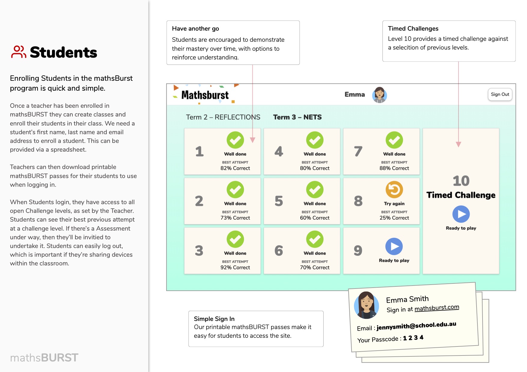
Many of our students share devices with their class mates and therefore need to log in and out of the program frequently. It's critical that students use their allocated accounts, we wanted students to personalise their account so it's easier to identify that they're logged in.
The 1st idea I tried was to allow students to create an Avatar in MathsBURST. I used an open source project called Avataaars by Stanley Pablo to get the idea up and running.
We quickly found that Students loved to create the Avataaars. Their creative Avataaars really makes the UI playful and fun for everyone. Teachers could better identify students in their reports and class management. Having a fun representation of students in the app was handy.
Student Achievement
Our teams educators identified that students needed to self reflect on their progress during a game. We want students to celebrate when they're showing mastery of the concept, or stop and seek help from a teacher when they're struggling. Using a student's own Avatar is a handy way to engage students. To make the moment even more engaging I collaborated with illustrator and animator James Daley to produce background animations using Lottie. Our students loved seeing themselves celebrate their own progress.

Good job!

Is this frustrating?

You got them all!
Game Design Process
The goal of our games is to give students and the teacher confidence that a student has understood a concept covered in our lesson plans. My role was to make sure the game is translated into a UX on the web, making sure the UI supports the challenge and doesn't burden the students with extra load and stress, to an already challenging experience.
Our education experts have a strong understanding of what a game should test, and what is challenging about a game. Our team would break the challenge concept into multiple needs, and I would show how those concepts could work in the browser, using conventional and unconventional UI patterns.
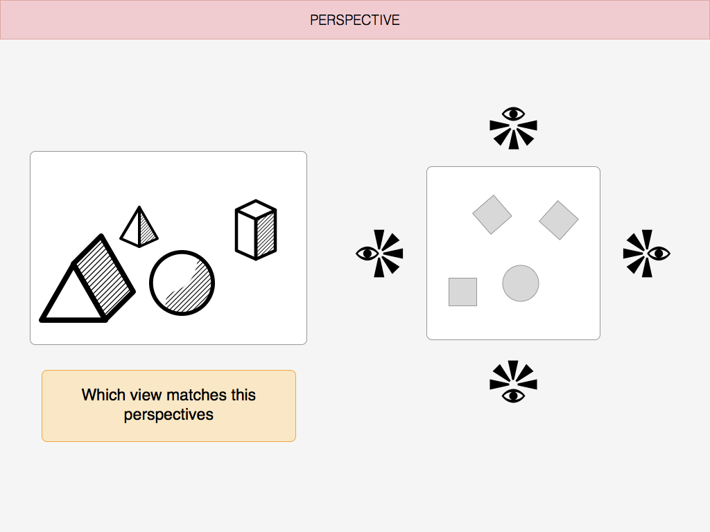
Early sketch
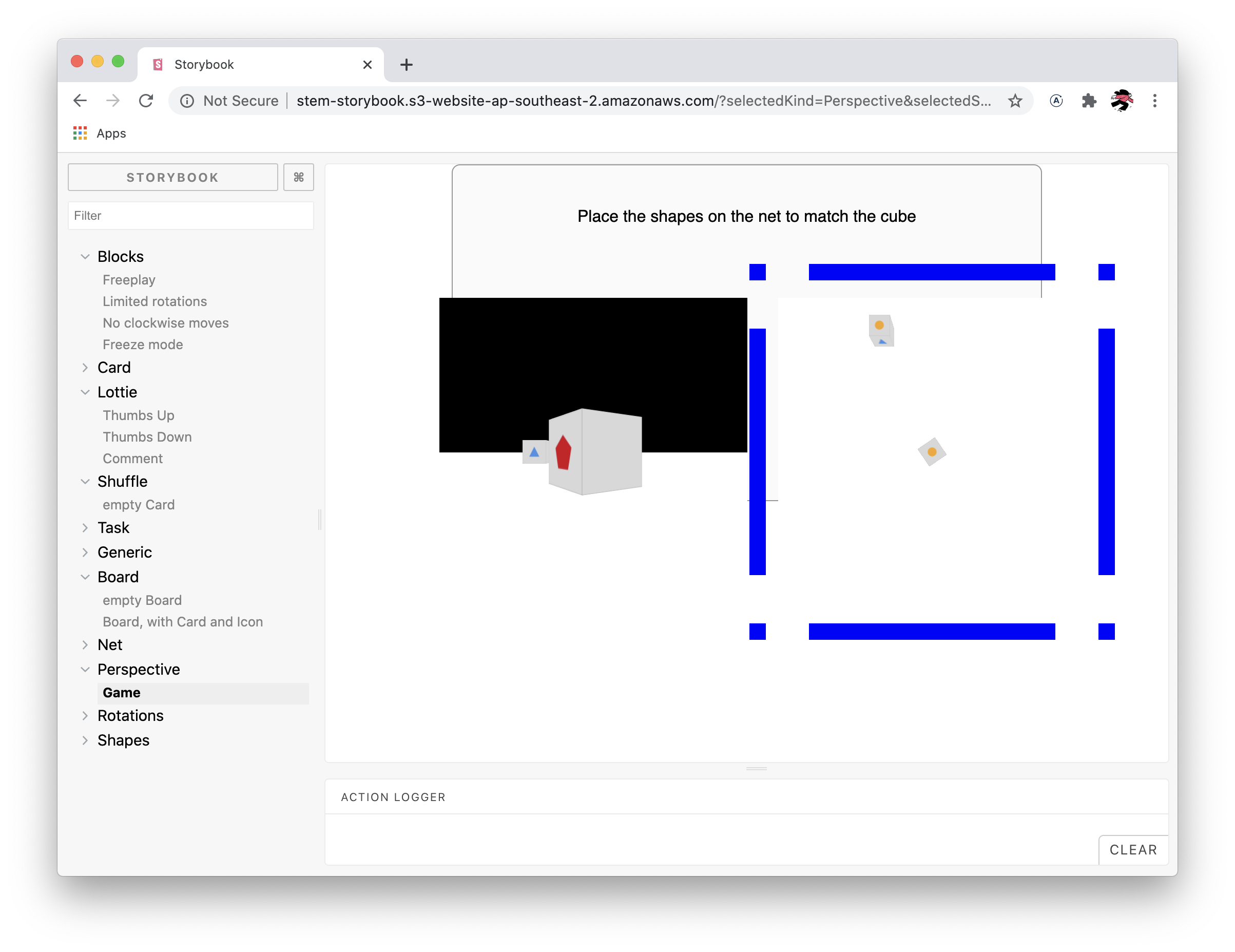
Prototype using Three.js
More prototyping experimenting with colour contrast, using Three.js

Example of how a game could be configured in Airtable and previewed in Storybook.
I was able to draw on my experience as a game designer on Active Memory, to make sure our workflow was favorable to rapid iteration. Quickly prototyping the challenge using JavaScript React components would allow us to test many UIs quickly. I used Airtable and Storybook to allow the team to preview the work in progress, and tweak the parameters of the game. We'd then refine the game based on feedback from teachers and students. Rapidly building a game this way was very quick, as we could reuse components between games.
A key design principle of this project was that each challenge level reveal the answer, so students could be sure of where they went wrong. These transitions were always animated to be revealed.

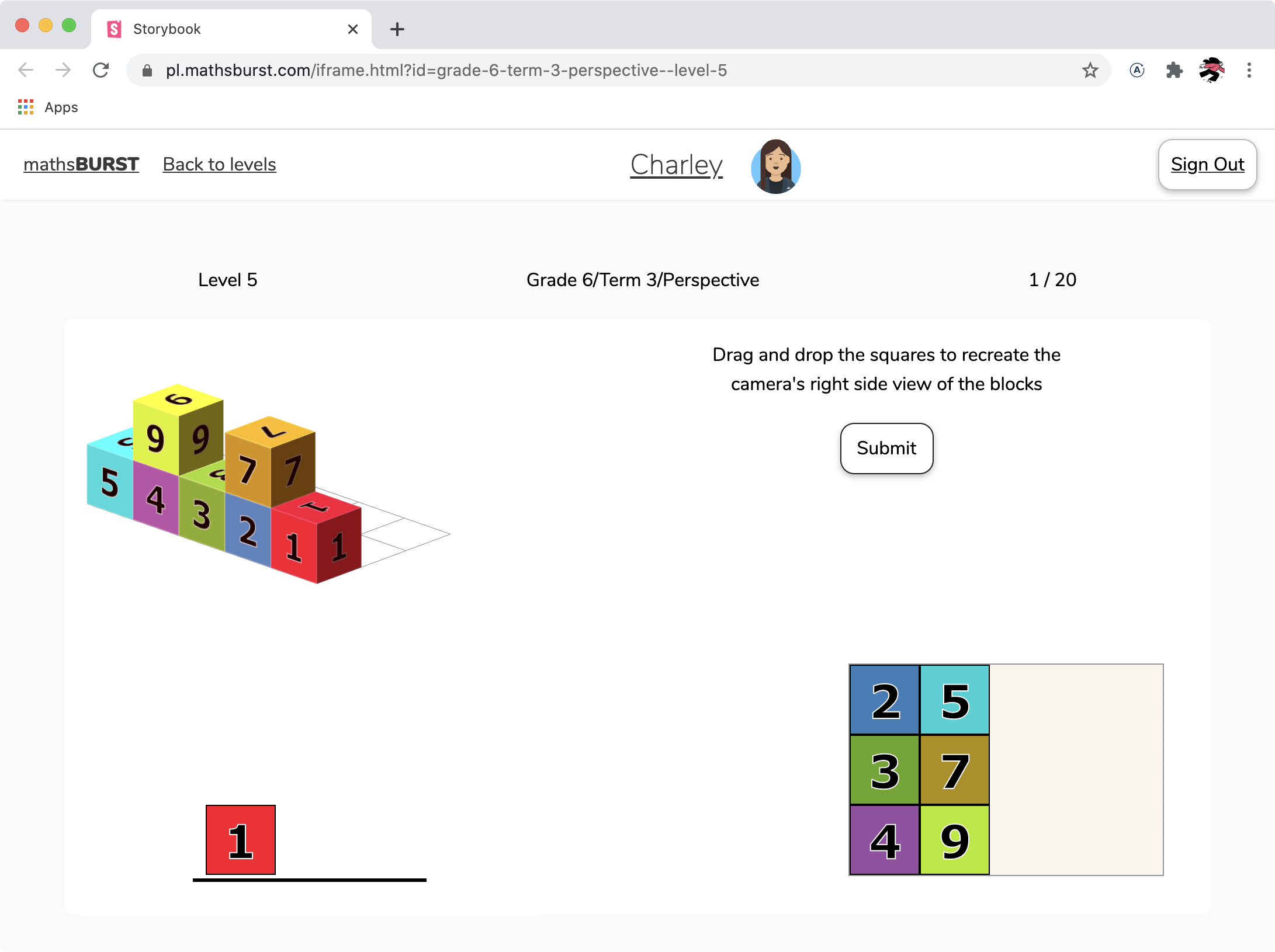
Example of a maths game question for Grade 3.

We always take care to explain the correct answer.
Reflections
This project was a blast, and I learnt so much. It was really fun to try my hand at full stack development, and I was really proud of being able to stand up the service in such a short amount of time with the support of my team. I really appreciated the opportunity to utilise my learnings from a previous project Active Memory, and the Challenges I built for students I thought were effective and easy to iterate.
Finally for all the teachers who use MathsBURST in their classroom, thanks for giving us a go and all your wonderful feedback. The fact that MathsBURST was used by thousands and thousands of students across Australia, is really humbling to me.
